Back To Top

February 15, 2024

Dynamic Risk Management Using Rolling Stock Price Metrics

15 Time-varying Techniques for Proactive Risk Analytics in Python [Part 1/2]

Dynamic risk management, at its core, is the identification, assessment, and prioritization of risks followed by coordinated and economical application of resources to minimize, monitor, and control the probability or impact of unforeseen events.

In the financial world, risk management plays an indispensable role in ensuring that investment strategies are sound, companies remain solvent, and stakeholders are shielded from potential financial hazards.

Traditionally, risk management strategies were formulated based on historical data and set models which, although effective to a degree, couldn’t adapt swiftly to the rapidly changing landscapes of modern financial markets.

This is where dynamic risk management have stepped in. Across global boardrooms, in the algorithms of hedge funds, and among individual investors, dynamic risk management is now crucial.

In a two-part series, we implement, interpret, and customize 15 dynamic risk management techniques in Python crucial for today’s Financial Analysts and Data Scientists alike:

  1. Historical Volatility
  2. Sharpe Ratio
  3. Treynor Ratio
  4. Rolling Beta
  5. Jensen’s Alpha
  6. Value at Risk
  7. Conditional Value at Risk
  8. Tail Ratio
  9. Omega Ratio
  10. Sortino Ratio
  11. Calmar Ratio
  12. Stability of Returns
  13. Maximum Drawdown
  14. Upside Capture and Downside Capture
  15. Pain Index

This article covers the first seven techniques of dynamic risk management. For a complete exploration, ensure you also read the second part which covers the remaining eight methods:

Further Implementation of Dynamic Risk Management Methods in Python

This continuation article brings to light tools specifically tailored to measure extremities, stability, and investor sentiments in financial markets. - Tail Ratio, Omega Ratio, Sortino Ratio, Calmar Ratio, Stability of Returns, Maximum Drawdown, Upside Capture and Downside Capture, Pain Index

2. Dynamic Risk Management in Python

2.1 Historical Volatility

Historical volatility (or realized volatility) quantifies the extent of price fluctuations over a specified period. It provides insights into the unpredictability of an asset. The most common approach to calculating historical volatility is to determine the standard deviation of daily returns over a rolling window, typically scaled to annualize the value for comparison purposes.

historical volatility entreprenerdly.com

Equation. 1: Formula illustrating the computation of daily historical volatility. The calculation is based on returns of stock prices and provides a measure of how much the stock has fluctuated on a day-to-day basis in the past.

Where ˉRˉ is Average daily return over the N days. Daily volatitility can be converted to annual volatility by using the following formula

annual volatility entreprenerdly.com

Equation. 2: Formula for converting daily historical volatility to annualized volatility. The transformation incorporates the square root of the number of trading days in a year (typically 252), offering a more long-term perspective on stock price fluctuations.

Higher historical volatility indicates greater price unpredictability and potentially higher investment risk. The rolling nature of this metric ensures we get a dynamic view, letting investors understand how volatility is changing over time.

				
					import yfinance as yf
import numpy as np
import pandas as pd
import matplotlib.pyplot as plt

# Define the ticker
ticker = "AFX.DE"

# Download the data
data = yf.download(ticker, start='2010-01-01', end='2023-12-21')

# Calculate the daily returns
data['Return'] = data['Close'].pct_change()

# Calculate the rolling volatility (21-day window)
data['Rolling_Volatility'] = data['Return'].rolling(window=21).std() * np.sqrt(252)

# Calculate the volatility of volatility
data['Vol_of_Vol'] = data['Rolling_Volatility'].rolling(window=21).std()

# Create a new figure with a specific size
plt.figure(figsize=(20, 10))

# Create primary axis
ax1 = data['Rolling_Volatility'].plot(label='Rolling Volatility', color='red', linewidth=2)
ax1.set_ylabel('Rolling Volatility', color='red')
ax1.set_title(f'{ticker} - Rolling Volatility vs. Volatility of Volatility', fontsize=16)
ax1.grid(True, which='both', linestyle='--', linewidth=0.5)

# Create secondary axis for Vol of Vol
ax2 = ax1.twinx()
data['Vol_of_Vol'].plot(ax=ax2, label='Volatility of Volatility', color='blue', linestyle='--', linewidth=0.5)
ax2.set_ylabel('Volatility of Volatility', color='blue')
ax2.set_ylim(0)

# Create third axis for stock price
ax3 = ax1.twinx()
ax3.spines['right'].set_position(('outward', 60))  # Move the last y-axis spine further to the right
data['Close'].plot(ax=ax3, label='Close Price', color='grey', alpha=0.5)
ax3.set_ylabel('Stock Price', color='grey')
ax3.set_ylim(0)

# Legends
ax1.legend(loc='upper left')
ax2.legend(loc='upper right')
ax3.legend(loc='center right')

plt.tight_layout()
plt.show()
				
			
Dynamic Risk Management Rolling Volatility Output Entreprenerdly.com

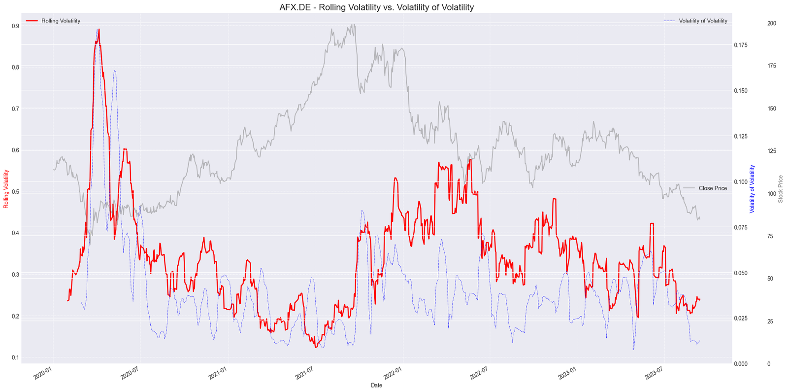
Figure. 1: The graph presents a multi-dimensional view of “AFX.DE” stock dynamics over time. The red solid line depicts the 21-day Rolling Volatility, highlighting periods of significant price fluctuations. In blue dashed lines, the Volatility of Volatility (VoV) offers a meta-view of the stability of the rolling volatility itself. The translucent grey line traces the stock’s closing price throughout the period. Together, these metrics provide a comprehensive insight into the stock’s risk profile and price evolution.

2.2 Sharpe Ratio

The Sharpe Ratio, named after its founder William F. Sharpe, is a metric used to evaluate the risk-adjusted performance of an investment. Specifically, it measures the excess return for each unit of risk taken by an investment, with the risk typically represented by the standard deviation of returns. A higher Sharpe Ratio indicates that the investment is providing a higher return for its level of risk. When calculated over a rolling window, the Sharpe Ratio provides a dynamic view of how the risk-return trade-off evolves over time.

Sharpe Ratio Formula www.entreprenerdly.com

Equation. 3: Formula for the Sharpe Ratio, which measures the performance of an investment relative to the risk-free rate, adjusted for its risk.

  • Rp​ is the expected portfolio return
  • Rf​ is the risk-free rate
  • σp​ is the standard deviation (or volatility) of the portfolio’s excess returns.

The Sharpe Ratio is often used to compare the risk-adjusted returns of different investments. A value greater than 1 suggests that the investment yields a return greater than the risk it entails.

				
					import pandas as pd
import numpy as np
import yfinance as yf
import matplotlib.pyplot as plt

tickerSymbol = "ASML.AS"
tickerData = yf.Ticker(tickerSymbol)
tickerDf = tickerData.history(period='1d', start='2010-1-1')
tickerDf['returns'] = tickerDf['Close'].pct_change()

# Annualized Sharpe Ratio
rolling_sharpe = np.sqrt(252) * tickerDf['returns'].rolling(252).mean() / tickerDf['returns'].rolling(252).std()

plt.figure(figsize=(15,7))
ax1 = plt.gca()
ax1.plot(rolling_sharpe, label='Rolling Sharpe Ratio', linewidth=1.5)
ax1.axhline(y=1, color='red', linestyle='--', label='Good Sharpe Ratio Threshold: 1')
ax1.set_title('Rolling 1-Year Sharpe Ratio with Stock Price', fontsize=16)
ax1.set_ylabel('Sharpe Ratio', fontsize=14)
ax1.legend()

ax2 = ax1.twinx()
ax2.plot(tickerDf['Close'], color='grey', alpha=0.3, label='Stock Price')
ax2.set_ylabel('Stock Price', fontsize=14)

plt.tight_layout()
plt.show()
				
			
Dynamic Risk Management Rolling Sharpe Ratio Chart www.entreprenerdly.com

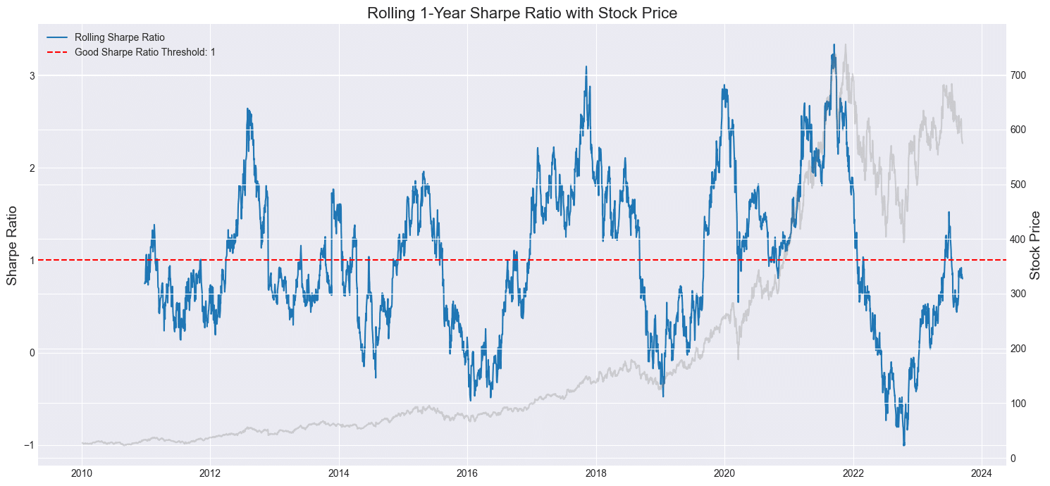
Figure. 2: Visualizing the 1-Year Rolling Sharpe Ratio for “ASML.AS”: Balancing Risk-Adjusted Returns against Stock Price Movements from 2010–2024. The red dashed line represents the commonly accepted ‘good’ Sharpe Ratio threshold of 1.

2.3 Treynor Ratio

The Treynor Ratio, sometimes referred to as the reward-to-volatility ratio, gauges the performance of an investment relative to the amount of market risk it has undertaken. Similar to the Sharpe Ratio, which uses total risk (standard deviation) as its risk measure, the Treynor Ratio specifically uses systematic risk (beta) to evaluate how well an investment has performed above the risk-free rate for its exposure to market risk.

Treynor Ratio Formula www.entreprenerdly.com

Equation. 4: Formula for the Treynor Ratio, which quantifies the excess return earned by a portfolio per unit of systematic risk, as captured by its beta with respect to the market.

The Treynor Ratio helps investors determine how much return they’re receiving for the systematic risk they’ve undertaken. A higher value indicates better performance on a per-unit-of-risk basis.

				
					import pandas as pd
import numpy as np
import yfinance as yf
import matplotlib.pyplot as plt

# Fetch data
tickerSymbol = "MSFT"
tickerData = yf.Ticker(tickerSymbol)
tickerDf = tickerData.history(period='1d', start='2010-1-1')
tickerDf['returns'] = tickerDf['Close'].pct_change()

# Market data for benchmark (S&P500)
market_data = yf.Ticker("^GSPC").history(period='1d', start='2010-1-1')
market_data['returns'] = market_data['Close'].pct_change()

# Align indices
market_data = market_data.reindex(tickerDf.index, method='ffill')

window_size = 252

# Calculate rolling beta
covariance = tickerDf['returns'].rolling(window=window_size).cov(market_data['returns'])
variance = market_data['returns'].rolling(window=window_size).var()
rolling_beta = covariance/variance

# Calculate rolling Treynor Ratio
risk_free_rate = 0
avg_rolling_returns = tickerDf['returns'].rolling(window=window_size).mean()
tickerDf['rolling_treynor_ratio'] = (avg_rolling_returns - risk_free_rate) / rolling_beta

fig, ax1 = plt.subplots(figsize=(14, 7))

color = 'tab:red'
ax1.set_xlabel('Date')
ax1.set_ylabel('Rolling Treynor Ratio', color=color)
ax1.plot(tickerDf['rolling_treynor_ratio'], label="Rolling Treynor Ratio", color=color)
ax1.tick_params(axis='y', labelcolor=color)
ax1.grid(True)
ax1.legend(loc="upper left")

ax2 = ax1.twinx()  
color = 'tab:blue'
ax2.set_ylabel('Stock Price', color=color)  
ax2.plot(tickerDf['Close'], label="MSFT Stock Price", color=color, alpha=0.3)
ax2.tick_params(axis='y', labelcolor=color)

ax3 = ax1.twinx()
color = 'tab:green'
# Offset the twin axis to the right
ax3.spines['right'].set_position(('outward', 60))
ax3.set_ylabel('Benchmark Price', color=color)
ax3.plot(market_data['Close'], label="Benchmark (S&P 500)", linestyle="--", color=color, alpha=0.3)
ax3.tick_params(axis='y', labelcolor=color)

fig.tight_layout()  # otherwise the right y-label is slightly clipped
ax3.legend(loc="upper right")

plt.title('Rolling 1-Year Treynor Ratio with Stock Price and Benchmark')
plt.tight_layout()
plt.show()
				
			
Dynamic Risk Management rolling treynor ratio www.entreprenerdly.com

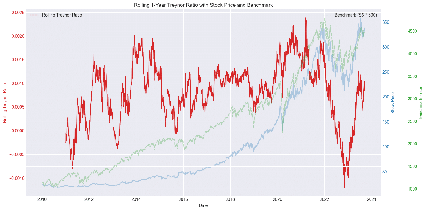
Figure. 3: Comparative Analysis of MSFT’s Performance (2010–2024): Rolling 1-Year Treynor Ratio juxtaposed against “MSFT” stock price and the S&P 500 benchmark. This visualization aids in evaluating risk-adjusted performance relative to market movements.

2.4 Rolling Beta

Rolling Beta provides a dynamic view of an asset’s risk relative to the broader market, adapting to recent trends and shifts. Beta itself is a critical metric in financial analysis, quantifying the sensitivity of a stock or portfolio’s returns to market fluctuations. A beta value greater than 1 indicates that the asset exhibits higher volatility than the overall market, while a beta less than 1 signifies its returns are less volatile in comparison. It’s defined by the equation:

rolling beta formula www.entreprenerdly.com

Equation. 5: Formula for the Treynor Ratio, which quantifies the excess return earned by a portfolio per unit of systematic risk, as captured by its beta with respect to the market.

Where:

  • Rp​ = Return of the portfolio or stock
  • Rm​ = Return of the market
  • Cov(Rp​,Rm​) = Covariance between the portfolio (or stock) and the market
  • Var(Rm​) = Variance of the market

The chart below displays the rolling beta values using RANSAC and OLS methods. RANSAC offers smoother estimates due to its outlier resistance, while OLS can be more volatile. Consistent values between the methods suggest minimal outlier impact; divergences could indicate outliers or non-linear data relationships.

				
					import yfinance as yf
import pandas as pd
import numpy as np
import matplotlib.pyplot as plt
from sklearn.linear_model import RANSACRegressor, LinearRegression

# Download historical data for ticker and a market index (e.g., ^AEX)
ticker = "UNA.AS"
start_date = "2016-01-01"
end_date = "2025-09-01"
stock = yf.download(ticker, start=start_date, end=end_date)
market = yf.download("^AEX", start=start_date, end=end_date)

# Calculate daily returns
stock_returns = stock["Adj Close"].pct_change().dropna()
market_returns = market["Adj Close"].pct_change().dropna()

# Align dates and remove rows with missing data
aligned_data = pd.concat([stock_returns, market_returns], axis=1).dropna()
aligned_data.columns = [ticker, "Market"]

# Calculate rolling beta using RANSAC
window = 60  # Choose the length of the rolling window
ransac = RANSACRegressor()
ols = LinearRegression()
rolling_beta_ransac = []
rolling_beta_ols = []

for i in range(len(aligned_data) - window):
    X = aligned_data["Market"].iloc[i:i+window].values.reshape(-1, 1)
    y = aligned_data[ticker].iloc[i:i+window].values
    
    ransac.fit(X, y)
    beta_ransac = ransac.estimator_.coef_[0]
    rolling_beta_ransac.append(beta_ransac)

    ols.fit(X, y)
    beta_ols = ols.coef_[0]
    rolling_beta_ols.append(beta_ols)

# Plot rolling beta
plt.figure(figsize=(15,7))
plt.plot(aligned_data.index[window:], rolling_beta_ransac, label="RANSAC")
plt.plot(aligned_data.index[window:], rolling_beta_ols, label="OLS")
plt.xlabel("Date")
plt.ylabel("Rolling Beta")
plt.title(f"Rolling Beta of {ticker} using RANSAC and OLS")
plt.legend()
plt.grid()
				
			
Dynamic Risk Management rolling beta using RANSAC and OLS www.entreprenerdly.com

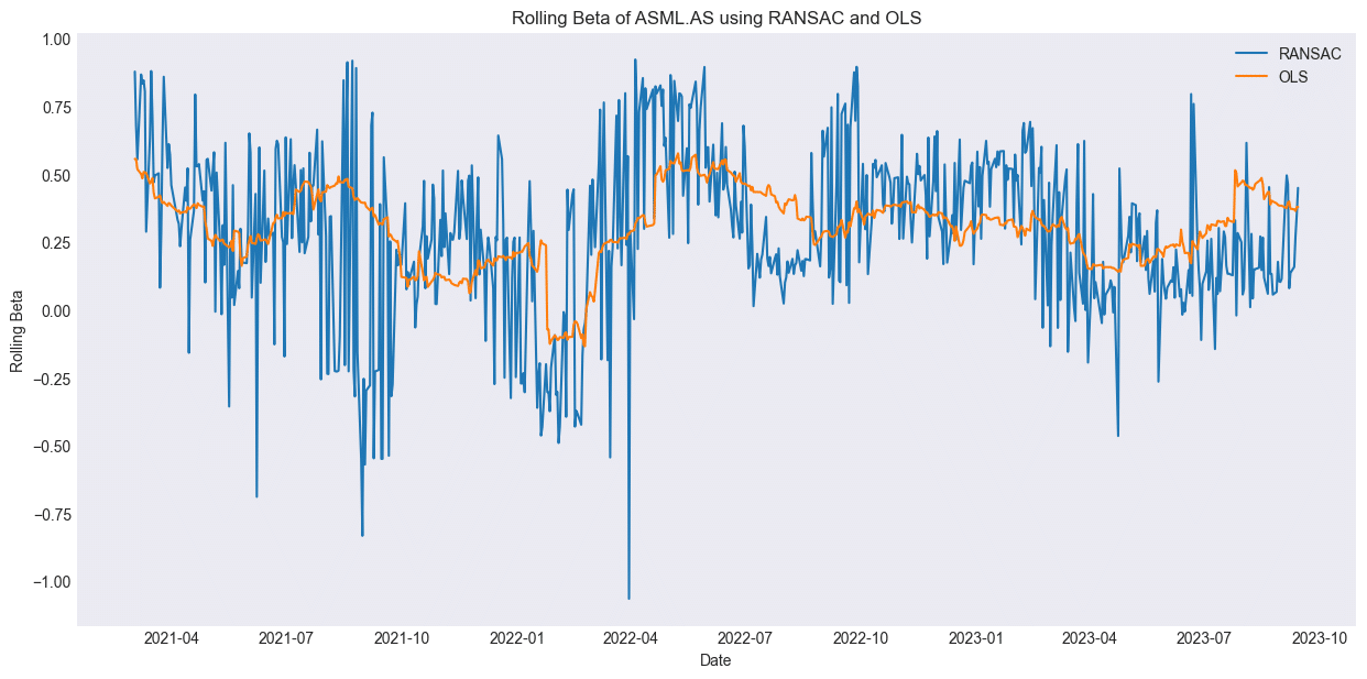
Figure. 4: Assessing Sensitivity to Market Fluctuations: Rolling Beta of “UNA.AS” (2016–2025) derived using both RANSAC and OLS methods. This comparative visualization offers insights into the stock’s responsiveness to broader market movements, highlighting potential anomalies and robustness in beta estimation.

2.5 Jensen’s Alpha

Jensen’s Alpha, often just termed Alpha, represents an investment’s average excess return after adjusting for the performance predicted by the Capital Asset Pricing Model (CAPM). Essentially, it quantifies how much an asset either outperforms or underperforms relative to its systematic risk. A positive Alpha suggests that an investment has yielded returns above its expected risk-adjusted returns, while a negative Alpha denotes underperformance.

jensen alpha formula www.entreprenerdly.com

Equation. 6: Formula for Jensen’s Alpha, which represents the abnormal return of a portfolio or security relative to the expected return predicted by the Capital Asset Pricing Model (CAPM). A positive Jensen’s Alpha indicates a strategy that has consistently beaten the market when adjusted for risk.

Where:

  • α = Jensen’s Alpha
  • Rp​ = Portfolio’s realized return
  • Rf​ = Risk-free rate
  • β = Portfolio’s beta with the market
  • Rm​ = Market’s realized return

The rolling Jensen’s Alpha graphically presents how the investment’s excess returns, adjusted for market risk, evolve over time. A period with positive Alpha suggests that the investment yielded a performance superior to the CAPM’s predictions, while a negative Alpha phase indicates that it didn’t meet expectations.

Prev Post

Algorithmically Identifying Stock Price Support and Resistance

Next Post

Further Implementation of Dynamic Risk Management Methods

post-bars
Mail Icon

Newsletter

Get Every Weekly Update & Insights

[mc4wp_form id=]

Leave a Comment