Back To Top

July 9, 2024

U.S. Treasury Yield Curve as a Key Economic Indicator

Yield Data Retrieval, Curve Interpretation, Spreads, Correlations, and Regime Shifts

The yield curve, a plot of Treasury bond yields across different maturities, serves as a crucial economic indicator. It reflects investor expectations about future interest rates, inflation, and economic growth. Understanding and analyzing the yield curve can provide valuable insights for investors and economists.

In this article, we explore U.S. Treasury yield curve analytics using Python. We will cover data retrieval, yield curve interpretation, spread analysis, correlations, interactive visualizations, regime shifts, and principal component analysis (PCA).

Google Colab Notebook provided with end-to-end implementation. For easier access, readers are encouraged to use Entreprenerdly’s yield curve tool to stay up to date with yield curve dynamics.

First, we retrieve U.S. Treasury yield data from the Federal Reserve Economic Data (FRED) database. This data forms the basis for our analysis. Next, we plot the yield curve over time to visualize interest rate trends and identify changes in the curve’s shape, which can signal economic shifts.

Then, we analyze yield spreads to compare yields on bonds of different maturities. This helps in understanding investor expectations and economic conditions. Positive spreads suggest growth and inflation expectations, while negative spreads can signal economic pessimism and potential recessions.

Using regime shift models, such as the Markov Switching Model, we identify periods of economic stability and stress by examining regime probabilities and yield spreads. 

Finally, PCA reduces the complexity of yield data by transforming it into principal components, highlighting key patterns and trends in interest rates and the yield curve. This helps us understand the main factors driving market changes.

1. U.S. Treasury Yield Data Retrieval

Let’s start by retrieving the U.S. Treasury yield data from the Federal Reserve Economic Data (FRED) database. While we primarily use yield data, FRED offers other key economic data such as unemployment rates, GDP growth figures, inflation rates, and consumer sentiment indices.

To begin, we define the start and end dates for the data retrieval. In our example, we use data from January 1, 2023, to June 30, 2025. This range provides a good view of recent trends and changes in the yield curve.

Next, we specify the tickers for different maturities, ranging from 1 month to 30 years. These tickers represent various points on the yield curve, allowing us to analyze short-term and long-term interest rates.

				
					import pandas as pd
import matplotlib.pyplot as plt
from pandas_datareader.data import get_data_fred
from datetime import datetime

# Define the start and end dates for the data
start_date = datetime(2023, 1, 1)  # Start date for data retrieval
end_date = datetime(2025, 6, 30)  # End date for data retrieval

# Retrieve the data for the yield curve
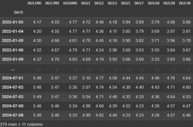
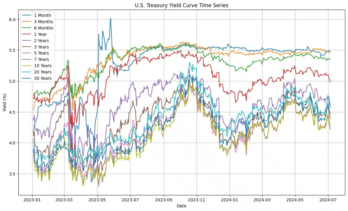
tickers = ['DGS1MO', 'DGS3MO', 'DGS6MO', 'DGS1', 'DGS2', 'DGS3', 'DGS5', 'DGS7', 'DGS10', 'DGS20', 'DGS30']
labels = {
    'DGS1MO': '1 Month',
    'DGS3MO': '3 Months',
    'DGS6MO': '6 Months',
    'DGS1': '1 Year',
    'DGS2': '2 Years',
    'DGS3': '3 Years',
    'DGS5': '5 Years',
    'DGS7': '7 Years',
    'DGS10': '10 Years',
    'DGS20': '20 Years',
    'DGS30': '30 Years'
}
# Fetch yield data from FRED for the specified tickers and date range
yield_data = get_data_fred(tickers, start=start_date, end=end_date)

# Drop rows with missing values to clean the data
yield_data = yield_data.dropna()


U.S. Treasury Yields Dataset

Figure. 1: Sample dataset of U.S. Treasury yields for various maturities from January 2023 to July 2024.

2. Yield Curve Time Series

We now visualize the U.S. Treasury yield curve over time. This helps us understand how interest rates for different maturities have evolved.  

First, we plot the yield data for each term to see the changes over time to see how short-term and long-term yields move.

Next, we dynamically interpret the data by calculating key statistics. This includes finding the highest, lowest, and average yields observed.

We then interpret the yield curve’s slope by calculating the difference between the longest and shortest maturity yields for each date.

The slope indicates the market’s economic expectations. An upward slope generally signals positive economic growth, while a downward slope can indicate potential economic slowdown or recession.

				
					# Plot the time series for each term
plt.figure(figsize=(14, 8))
for ticker in tickers:
    plt.plot(yield_data.index, yield_data[ticker], label=labels[ticker])

plt.title('U.S. Treasury Yield Curve Time Series')  # Title of the plot
plt.xlabel('Date')  # X-axis label
plt.ylabel('Yield (%)')  # Y-axis label
plt.legend()  # Display legend
plt.grid(True)  # Show grid
plt.show()  # Display the plot

# Dynamic interpretation
max_yield = yield_data.max().max()  # Find the highest yield in the data
min_yield = yield_data.min().min()  # Find the lowest yield in the data
mean_yield = yield_data.mean().mean()  # Calculate the average yield

print(f"The highest yield observed in the time series is {max_yield:.2f}%.")
print(f"The lowest yield observed in the time series is {min_yield:.2f}%.")
print(f"The average yield across all maturities and dates is {mean_yield:.2f}%.")

# Interpretation based on the slope of the yield curve
# Calculate the difference between the longest and shortest maturity for each date
slope_indicator = yield_data['DGS30'] - yield_data['DGS1MO']
average_slope = slope_indicator.mean()  # Calculate the average slope

if average_slope > 0:
    print("On average, the yield curve shows an upward slope, which often indicates positive economic growth expectations.")
else:
    print("On average, the yield curve shows a downward slope, which may suggest a potential economic slowdown or recession.")

# Interpretation based on the trend
trend = yield_data.diff().mean()  # Calculate the average difference between consecutive yields
positive_trend_count = (trend > 0).sum()  # Count of positive trends
negative_trend_count = (trend < 0).sum()  # Count of negative trends

if positive_trend_count > negative_trend_count:
    print("Overall, yields are increasing over time, indicating rising interest rates.")
else:
    print("Overall, yields are decreasing over time, indicating falling interest rates.")


Yield Curve Time Series Plot Entreprenerdly

Figure. 2: Time series of U.S. Treasury yields for various maturities from January 2023 to July 2024

The plot shows significant fluctuations in U.S. Treasury yields from January 2023 to July 2024. Short-term yields, like the 1 Month and 3 Month maturities, peaked around 6% in March 2023, while long-term yields, such as the 10 and 30 Year maturities, rose gradually, indicating steady long-term interest rates. This trend suggests expectations of future economic growth and inflation.

For investors, these movements highlight the need to monitor economic news and monetary policy closely. During volatile short-term yields, shifting to long-term bonds can lock in higher rates. Conversely, rising long-term yields offer better interest payments. The upward-sloping yield curve indicates positive economic expectations, but any flattening or inversion signals potential economic risks.

Also worth reading:

Tracking Congress Stock Trades In Python

Who, What, and When: Transactional-Level Analysis of Senators' Trades with Accuracy Measuremenets and Trends Through the FMP API and the SEC website.
Prev Post

Implied Volatility Analysis for Insights on Market Sentiment

Next Post

Multi-objective Portfolio Optimization

post-bars
Mail Icon

Newsletter

Get Every Weekly Update & Insights

[mc4wp_form id=]

Leave a Comment