Experience the Future of Intelligent Investing Today
Back To Top
Experience the Future of Intelligent Investing Today
Price action carries structural memory. Patterns echo across time. Some fade. Others repeat. Understanding these echoes gives you a tactical understanding.
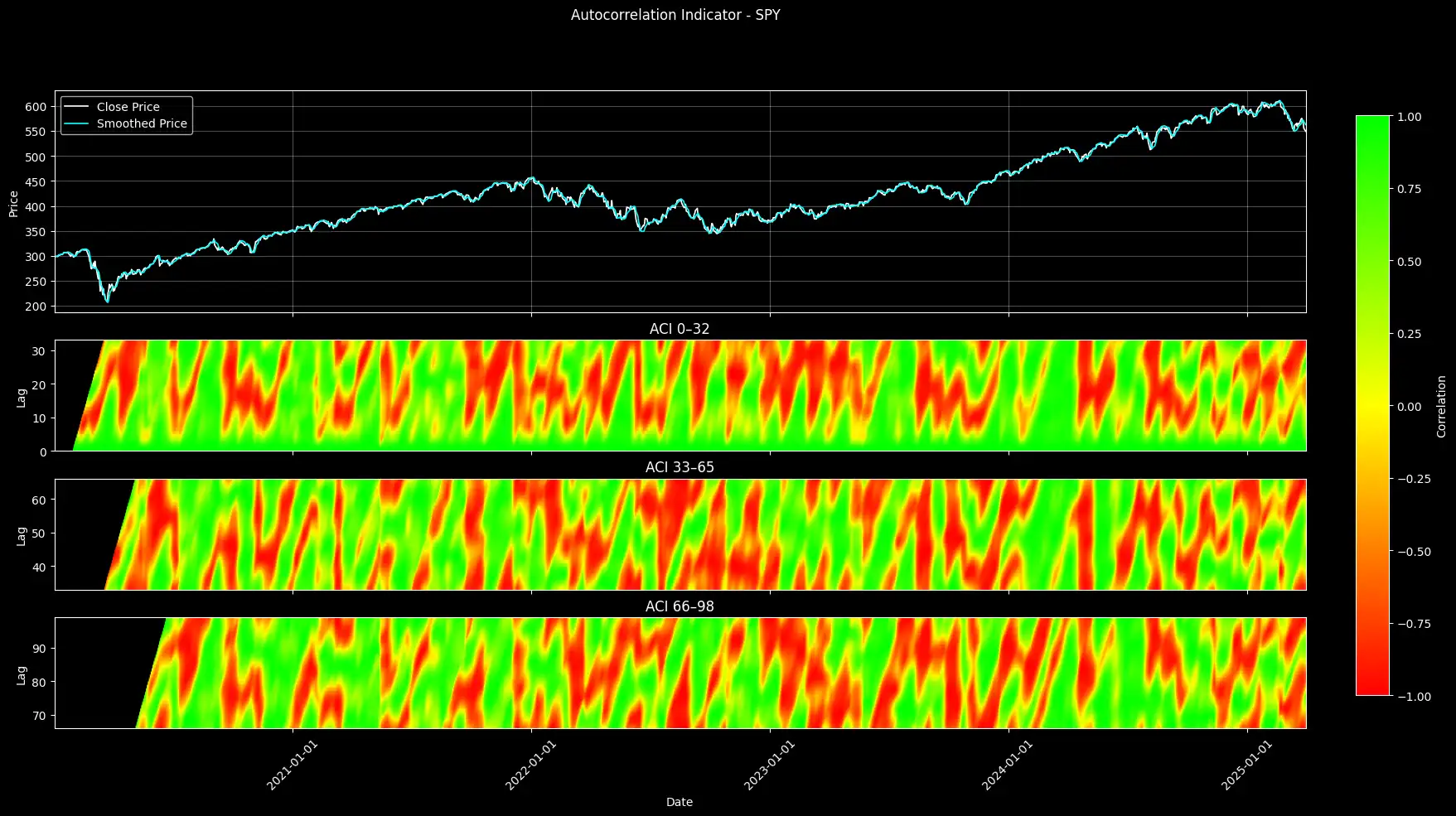
In this article, I’ll show you how to measure market memory using rolling autocorrelation across almost a 100 lags. You’ll learn how to visualize it using a heatmap that reveals where price behavior aligns with its own past.
We smooth the price series to remove short-term noise. Then we compare it to shifted versions of itself over dozens of lag intervals. The result? A four-panel chart that shows where — and how — the market “remembers” its recent patterns.

This article is structured as follows:
The full implementation notebook is provided below.
Autocorrelation measures how much a time series resembles a shifted version of itself.
In markets, it tells us whether recent price action aligns with earlier behavior.
A strong autocorrelation suggests the market is repeating a pattern. A weak one suggests randomness.
Technically, the autocorrelation coefficient ρ is calculated as:

Here, x and y represent two overlapping windows of the same signal at different lags. A ρ close to 1 means the two windows move together. A value near -1 means they move oppositely. Zero means no relationship.
But raw prices are noisy. Day-to-day fluctuations distort the signal. That’s why we apply smoothing first.
A smoother removes noise to show the underlying structure. This makes autocorrelation more meaningful.
Once we compute the autocorrelation at every time step and lag, we split the result into three lag bands:
Each band reflects a different “memory zone”. We can spot whether the market is recalling short-term behavior or echoing deeper historical patterns.
We begin by downloading daily price data for the ticker (in this case, SPY) from Yahoo Finance between 2020–01–01 and 2026–01–01.
					import yfinance as yf
import numpy as np
import pandas as pd
import matplotlib.pyplot as plt
import matplotlib.dates as mdates
import matplotlib.colors as mcolors

# Step 1: Download & Preprocess Data
# We pull daily data for the ticker, then adjust the columns if needed.
TICKER = "SPY"
START_DATE = "2020-01-01"
END_DATE   = "2026-01-01"

df = yf.download(TICKER, start=START_DATE, end=END_DATE, interval="1d", auto_adjust=True)
if df.empty:
    print("No data returned. Exiting.")
    exit()

# If we get a multi-index, flatten it; otherwise, clean column names.
if isinstance(df.columns, pd.MultiIndex):
    df.columns = df.columns.get_level_values(0)
else:
    df.columns = [c.split("_")[0] for c in df.columns]
To reduce market noise, we apply Ehlers’ Ultimate Smoother to the closing prices. This smoothing is defined by a recursive formula:

In this context, src refers to the input signal—specifically, the smoothed series’ source. In our case, that’s the array of closing prices.
The constants c1, c2, c3 are calculated based on the chosen period (here, a window of 20 bars).

Newsletter