Back To Top

August 14, 2025

Measuring Volatility Mean-Reversion

Quantify reversion speeds, regime persistence and visualize when volatility shocks fade or linger using Python.

Volatility fades faster than many headlines often suggest.

Over the last decade a shock to VIX loses half its value in roughly 20 trading days. The S&P 500 realized variance needs around 60 days.

Yet, when markets cross into a high-stress regime, the mean-reversion engine stalls. Half-life estimates stretch from days to months.

For example, Covid forced the clock off track and distored decade-long averages.

In these environments, “high-vol” states can linger for 93 days, with transition probabilities stacked 99-to-1 against a quick return to calm.

This article shows you how to track these volatility mechanics, i.e. how to estimate half-lives and detect volatility regime flips.

The complete Python notebook for the analysis is provided below.

Mean Reversion of Volatility Notebook Demo AVIF

Here, we’ll discuss the following:

  • VIX vs SP500 Realized Variance
  • Testing for Mean-Reversion
  • Measuring Volatility Half-Life
  • Volatility Regime Transition Probabilities

1. Volatility Clusters, But Always Mean-Reverts

Volatility clusters. High-risk periods don’t arrive alone, but travel in packs.

This “volatility clustering” is one of the most persistent features in financial data.

Yet, even as volatility surges, it does not drift aimlessly. Instead, it shows a stubborn tendency to snap back toward its historical average.

This is mean-reversion, and it defines the typical flow of market risk. A growing body of contemporar evidence confirms these patterns.

Studies show that volatility, whether measured from price returns or implied by options, routinely exhibits both short bursts and a strong pull back to the mean.

According to Gatheral and Oomen (2010), volatility shocks are sharp but temporary. Mean-reversion resets risk, even if the path is rough.

volatility_clustering_mean_reversion GIF

Figure 1. Volatility Clustering and Mean-Reversion Illustration. Simulated volatility (cyan) exhibits a sustained high-volatility cluster from t = 50 to 80 (orange annotation) before decaying back toward the long-run mean (magenta dashed line) around t = 120 (green annotation).

Andersen et al. (2020) extend this view and show how realized volatility in global equities consistently reverts after crisis spikes (though the “speed” of reversion varies by market and regime).

Markets expect volatility to settle. This expectation gets built into option premiums and portfolio hedges.

Empirical work also shows that implied volatility (like VIX) usually reverts faster than realized volatility (e.g. see Doran et al., 2021).

2. VIX vs SP500 Realized Variance in Python

By design, the VIX estimates the market’s expectation of S&P 500 realized volatility (‘RV’) over the next 30 calendar days.

To compare apples to apples, we use a 21-trading-day window, i.e. about one month of market activity, to measure the S&P 500 RV.

Decades of research, including Carr & Wu (2006), show that VIX systematically overestimates the volatility that actually occurs.

This “variance risk premium” compensates option sellers for bearing tail risk and uncertainty about the future.

With the code below, we retrieve the VIX and S&P500 data from yfinance using Python and plot them.

The first subplot shows both VIX and 21-day realized volatility since 2015. The second subplot shows the difference between VIX and S&P500 RV.

				
					import warnings
warnings.filterwarnings('ignore')

import numpy as np
import pandas as pd
import yfinance as yf
import matplotlib.pyplot as plt
from matplotlib.dates import MonthLocator, DateFormatter
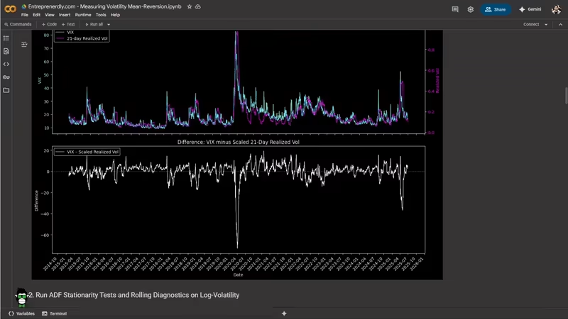
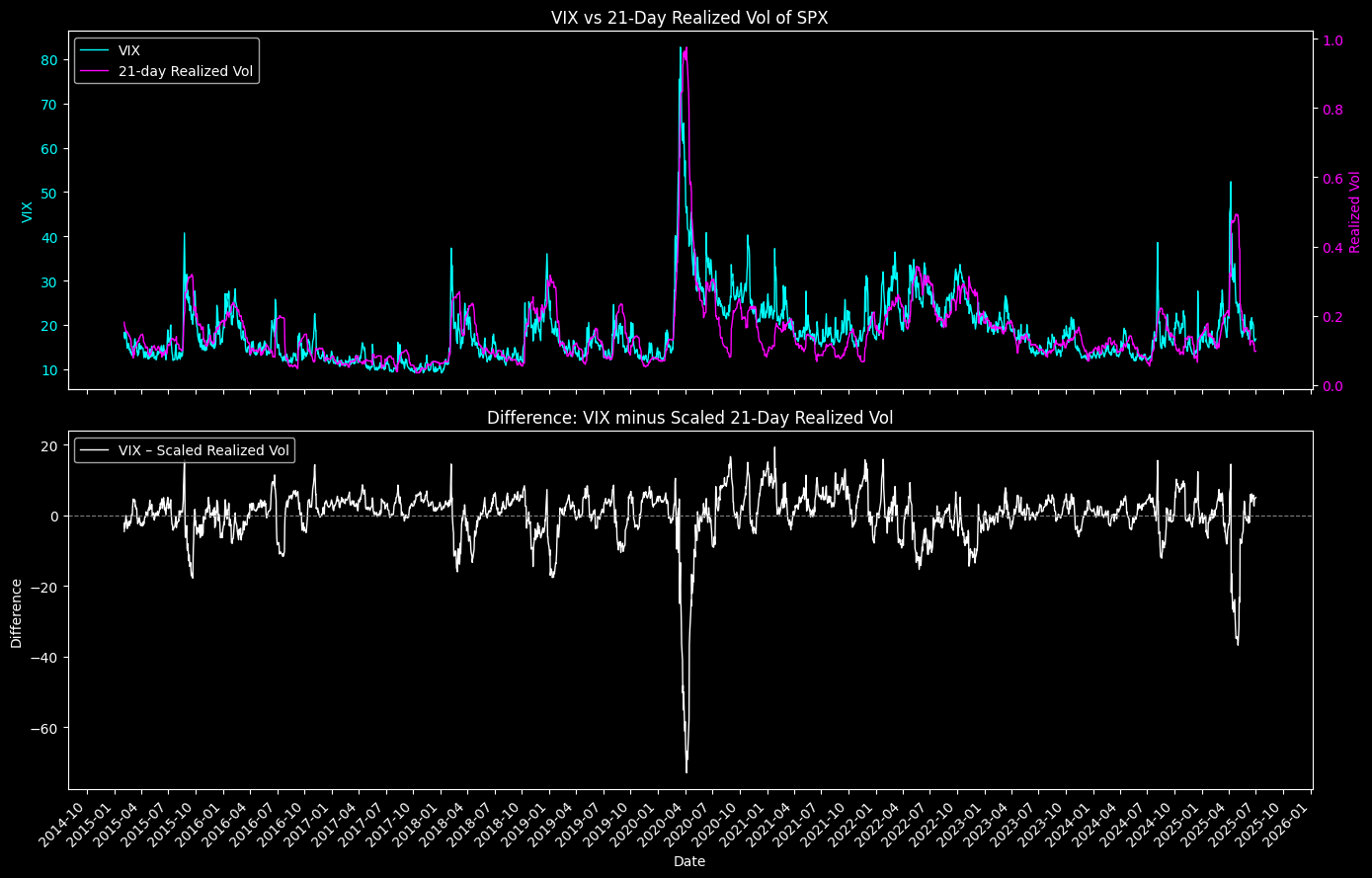
# 1. Download data
tickers = ['^VIX', '^GSPC']
start, end = '2015-01-01', '2025-07-02'
raw = yf.download(
    tickers,
    start=start,
    end=end,
    progress=False,
    auto_adjust=False
)

# 2. Extract series
vix = raw['Close']['^VIX']
spx = raw['Close']['^GSPC']

# 3. Flatten columns
if isinstance(raw.columns, pd.MultiIndex):
    raw.columns = raw.columns.get_level_values(0)
df = raw.copy()
df.columns = df.columns.map(str.title)

# 4. Compute 21-day realized volatility
window = 21
daily_ret = np.log(spx).diff()
real_vol = daily_ret.rolling(window).std() * np.sqrt(252)
real_vol = real_vol.dropna()

# 5. Align VIX to realized-vol dates
vix = vix.loc[real_vol.index]

# 6. Scale realized vol and compute difference
scale = vix.mean() / real_vol.mean()
real_scaled = real_vol * scale
diff = vix - real_scaled

# 7. Plot both charts as subplots
plt.style.use('dark_background')
fig, (ax1, ax2) = plt.subplots(2, 1, figsize=(14, 9), sharex=True)

# Subplot 1: VIX vs Realized Vol
ax1.plot(vix.index, vix, color='cyan', linewidth=1, label='VIX')
ax1.set_ylabel('VIX', color='cyan')
ax1.tick_params(axis='y', labelcolor='cyan')

ax1b = ax1.twinx()
ax1b.plot(real_vol.index, real_vol,
          color='magenta', linewidth=1,
          label=f'{window}-day Realized Vol')
ax1b.set_ylabel('Realized Vol', color='magenta')
ax1b.tick_params(axis='y', labelcolor='magenta')

lines1, labs1 = ax1.get_legend_handles_labels()
lines1b, labs1b = ax1b.get_legend_handles_labels()
ax1.legend(lines1 + lines1b, labs1 + labs1b, loc='upper left')
ax1.set_title('VIX vs 21-Day Realized Vol of SPX')

# Subplot 2: Difference (scaled)
ax2.plot(diff.index, diff,
         color='white', linewidth=1,
         label='VIX – Scaled Realized Vol')
ax2.axhline(0, color='gray', linestyle='--', linewidth=0.8)
ax2.set_xlabel('Date')
ax2.set_ylabel('Difference')
ax2.legend(loc='upper left')
ax2.set_title('Difference: VIX minus Scaled 21-Day Realized Vol')

# Common X-axis formatting
locator = MonthLocator(bymonth=(1, 4, 7, 10))
formatter = DateFormatter('%Y-%m')
ax2.xaxis.set_major_locator(locator)
ax2.xaxis.set_major_formatter(formatter)
plt.setp(ax2.get_xticklabels(), rotation=45, ha='right')

plt.tight_layout()
plt.show()
				
			
Figure 2. VIX and 21-Day Realized Vol of SPX Difference. The twin-axis view shows how options-implied risk and actual market variance evolve together and diverge across market cycles.

Figure 2. VIX and 21-Day Realized Vol of SPX Difference. The twin-axis view shows how options-implied risk and actual market variance evolve together and diverge across market cycles.

Most of the time, VIX leads, especially during shocks. The largest spike, March 2020, shows how quickly implied volatility reacts to market stress.

It often overshoot realized risk in the short term. The lower panel quantifies that difference.

The VIX exceeds scaled RV in nearly every window. Peaks in 2016, 2018, and 2022 flag market stress and uncertainty where option sellers demand more compensation.

The sharp dip in early 2020 is notable: RV briefly surpasses VIX. This reflected the speed and severity of the COVID market crash.

After major shocks, both VIX and RV mean-revert. The difference narrows as fear fades and RV “catches up” to implied expectations.

The baseline premium, i.e. that implied volatility consistently above realized, is a persistent feature and key take away.

2. Testing for Mean-Reversion

We test for mean-reversion in volatility using the Augmented Dickey-Fuller test.

ADF test examines whether a time series is stationary or contains a unit root.

Stationarity implies mean-reversion, whereas, a unit root means shocks persist indefinitely.

The test estimates the following regression:

Measuring Volatility Mean-Reversion

where yt​ is the log-transformed volatility series. The null hypothesis (H0​) is that γ=0, i.e. the series has a unit root (no mean-reversion).

We apply the ADF test to both log(VIX) and log(RV).

Prev Post

The 11 Greatest Trades in Stock Market History

Next Post

Scanning Optimal Credit Spreads

post-bars
Mail Icon

Newsletter

Get Every Weekly Update & Insights

[mc4wp_form id=]

Leave a Comment