Automatically Going From Raw Data to Insight, Empowering Data-Driven Decisions Much Quicker
This article explores LIDA, Microsoft’s innovative tool for interactive data visualization. Uniquely, LIDA harnesses large language models, transforming complex datasets into insightful visual representations.
LIDA excels with datasets that convert into pandas DataFrames, simplifying data processing from CSV to JSON. Furthermore, its compatibility highlights its adaptability in data science workflows, automating insightful and visually engaging data representations.
We will examine how LIDA boosts data analysis for professionals and beginners alike. This marks a significant leap in data science, democratizing access to straightforward data analysis.
The article will cover these points:
- Interactive Data Analysis LIDA and Fetching a Dataset from Huggingface
- Connect Lida to OpenAI, Summarize, Generate Goals and Automatic Charts
- Generate Vizualization and Goals via a 'User Query' and Personas
- Retrieve Python Code and Explain Generated Charts
- Refine Vizualization with Natural Language
- Visualization Code Self-Evaluation and Repair
- Visualization Recommendation and Automatic Infographics Generation (BETA)
1. Interactive Data Analysis LIDA
LIDA, as outlined in “LIDA: A Tool for Automatic Generation of Grammar-Agnostic Visualizations and Infographics using Large Language Models”, exemplifies the integration of advanced language models for data visualization.
The process begins with the ‘Summarizer’ module, which distills datasets into concise natural language representations. This context is then used by the ‘Goal Explorer’ to hypothesize analytical goals and potential insights. The ‘Viz Generator’ takes these goals to create executable visualization code, which can be in any programming language.
Finally, the ‘Infographer’ module stylizes these visualizations into infographics based on user-defined style prompts.
The image below in the article illustrated this workflow from data summarization to infographic generation. It highlights LIDA’s capability to democratize data visualization to a broader audience.

Figure. 1: LIDA Framework's Modular Process for Interactive Data Visualization. This image illustrates the LIDA framework's process, starting with the Summarizer module that interprets datasets into natural language, to the Goal Explorer and Viz Generator that conceptualize and execute data visualizations. Source: https://arxiv.org/pdf/2303.02927.pdf
2. Python Implementation
2.1 Data Acquisition
We start by retrieving a public dataset. The Spotify dataset from Huggingface offers a wide range of track attributes, ideal for in-depth data analysis.
The code below demonstrates the process of loading this dataset and converting it into a pandas DataFrame, which is a prerequisite for subsequent analysis with LIDA.
					# Retrieve Spotify Data from Huggingface
dataset = load_dataset("maharshipandya/spotify-tracks-dataset")

# Convert the dataset to a Pandas DataFrame
df = pd.DataFrame(dataset['train'])

# Inspect Data
df
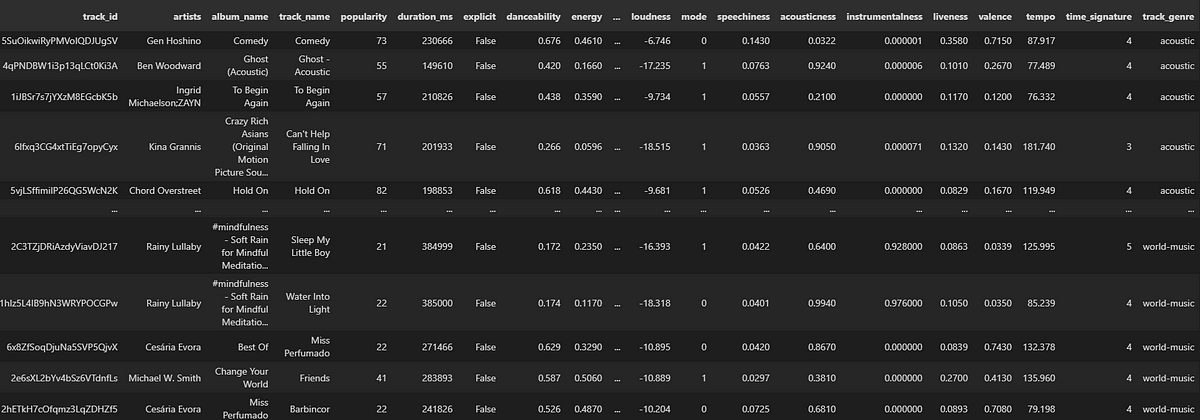
Figure. 2: Excerpt from the Spotify tracks dataset displayed as a pandas DataFrame, illustrating the diversity of data available for analysis, from artists to popularity and track genre.
2.2 Connect Lida to OpenAI, Summarize and Generate Goals
LIDA can be integrated with OpenAI’s language models to process and summarize complex data. This involves setting up the LIDA Manager with a configuration that taps into OpenAI ’s API capabilities for text generation. Authentication is managed via an API key, and the setup defines parameters for the output, such as response quantity and creativity level.
The summarization step contextualizes the dataset, leading to the generation of analytical goals. These goals are then used to guide the creation of data visualizations. They ensure relevance and insight into the dataset’s different aspects. This automated workflow streamlines the journey from raw data to actionable visual stories.
With textgen_config, we control the generation process, setting n=1 to obtain a single response per request and temperature to 0.2, which balances creativity and randomness. The model parameter is set to “gpt-4–1106-preview”, indicating the specific language model variant in use.
The summarize method then condenses the data into a comprehensive summary, which serves as context for the goals function. This function generates questions and objectives, prompting the user to explore the data in depth. Each goal is crafted by LIDA to guide the visualization process, ensuring that the generated charts are both informative and relevant.
					# Importing necessary modules and configurations
from lida.components import Manager
from lida.datamodel import TextGenerationConfig

# Initialize the Manager with text generation capabilities
# An LLM from OpenAI is used, authenticated with an API key
lida = Manager(text_gen = llm("openai", api_key='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'))

# Setting up the text generation configuration
# n=1: Generate one piece of text per request
# temperature=0: Produces deterministic, less random responses
# model: Specifies the model to use, here it's "gpt-4-1106-preview"
# use_cache=True: Enables caching of results to improve speed and reduce API calls
textgen_config = TextGenerationConfig(n=1, temperature=0.2, model="gpt-4-1106-preview")#, use_cache=True)

# Summarize the data
# df: The DataFrame or file path containing the data to be summarized
# summary_method=llm: Use the large language model for summarizing/enriching the data
# textgen_config: The configuration for text generation as defined above
summary = lida.summarize(df, textgen_config=textgen_config)

# The summarize method
# data: The primary input data (DataFrame or file path)
# file_name: Optional name of the file if data is loaded from a file
# n_samples: The number of summary samples to generate (default is 3)
# summary_method: The method for summarizing data ('default' or 'llm')
# textgen_config: Configuration for text generation
# Returns a Summary object containing the generated summary

# Generate goals based on the summary
goals = lida.goals(summary, n=3, textgen_config=textgen_config)

# Display the goals
for goal in goals:
    display(goal)

Figure. 3: An outline of analytical goals generated by LIDA, detailing the interrogation of a music dataset to reveal underlying patterns and relationships.
2.3 Produce Chart of a Goal
The focus now shifts to visualizing specific analytical goals derived from data summaries. LIDA’s visualize function is invoked with the seaborn library. While seaborn is utilized here, alternative libraries like Matplotlib, Plotly orggplot2 could also serve this purpose, offering a variety of styles and interactive features.
The goal, identified by its index (i = 2), directs the generation of a corresponding chart. The resultant visualization—a box plot—effectively compares the distribution of popularity scores between explicit and non-explicit tracks.
This direct mapping from a textual goal to a graphical representation illustrates LIDA’s capacity to translate analytical queries into tangible insights.
					# Example of visualizing the first goal
i = 2
library = "seaborn"
charts = lida.visualize(summary=summary, goal=goals[i], textgen_config=textgen_config, library=library)

# Display the first chart
if charts:
    charts[0]

charts[0]
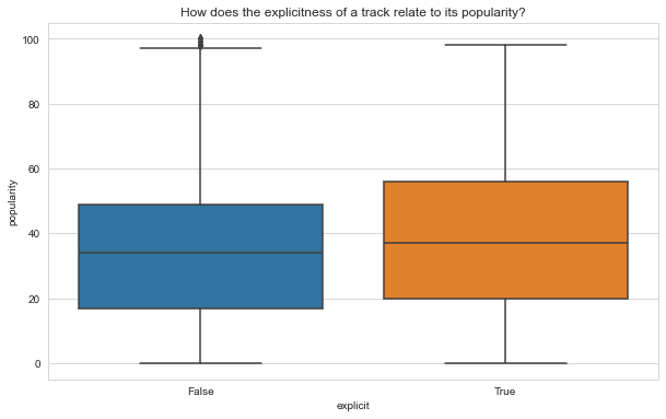
Figure. 4: This box plot, automatically generated by LIDA, visually contrasts the popularity distribution between explicit and non-explicit Spotify tracks, offering a clear perspective on the impact of explicitness on a track's reception.
2.4 Generate Vizualization via a ‘User Query’
By configuring LIDA with a textgen_config that emphasizes deterministic output (temperature=0), the tool can generate visualizations that directly correspond to the user’s request.
Moreover, a query asks to identify characteristics associated with high popularity. LIDA processes this query to produce a visualization, such as the box plot shown. This plot provides a comparative analysis of different musical traits against popularity levels.
					user_query = "What characteristics are associated with the highest popularity?"
textgen_config = TextGenerationConfig(n=1, temperature=0, use_cache=True)
charts = lida.visualize(summary=summary, goal=user_query, textgen_config=textgen_config)
charts[0]
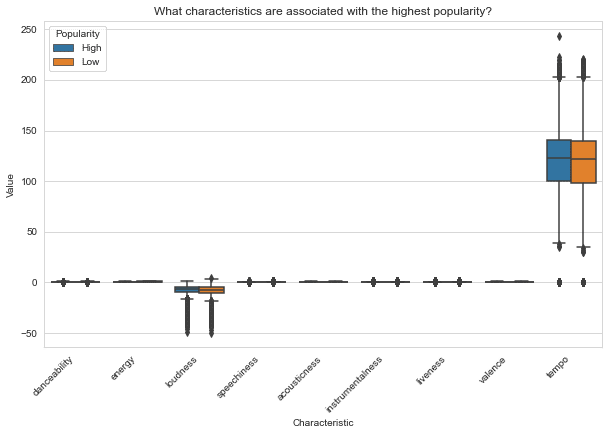
Figure. 5: Box plot visualization automatically generated from a user query in LIDA, comparing the distribution of various musical characteristics against tracks' popularity levels.
2.5 Generate Golas via a ‘User Query’ and Persona
LIDA can generate visualization goals influenced by a user-defined persona. The persona, stating a desire to understand the characteristics associated with high track popularity, informs the generation of personalized goals.
By setting textgen_config with a slight temperature, the system is allowed to introduce a controlled degree of variability in the response. Thus, not just the most common patterns but also less obvious, potentially insightful trends are considered.
					# goals can also be based on a persona
persona = "I want to know the characteristics are associated with the highest popularity."
personal_goals = lida.goals(summary, n=5, persona=persona, textgen_config=textgen_config)
for goal in personal_goals:
    display(goal)

i = 0
library = "seaborn"
textgen_config = TextGenerationConfig(n=1, temperature=0.2, use_cache=True)
charts = lida.visualize(summary=summary, goal=personal_goals[i], textgen_config=textgen_config, library=library)
charts[0]
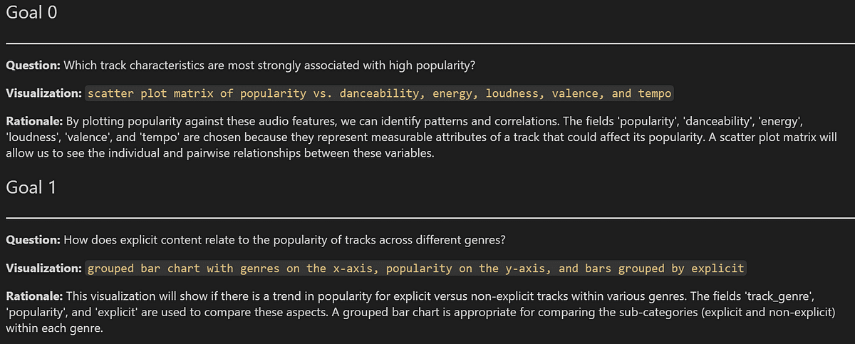
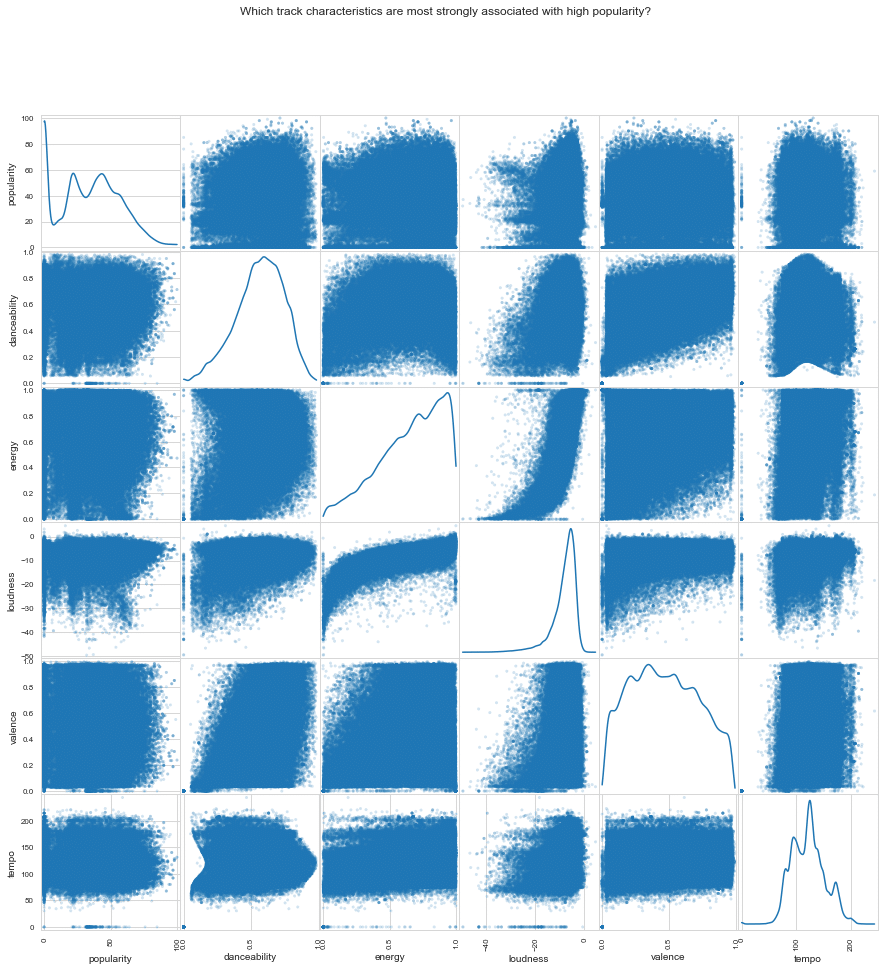
Figure. 6: Scatter plot matrix created using LIDA, revealing the intricate relationships between track popularity and various audio features, as directed by user-defined analytical goals.
2.6 Retrieve Python Code and explain generated chart
The charts[0].codecan be used to display the code that has been generated. This typically includes the Python libraries used, the plotting function, and the configuration of the plot itself.
Then, lida.explain() is called to provide explanations for each part of the code. This function uses the language models to parse the code and generate a plain English description.
For example, in the snippet shown below, there’s a definition of a plotting function that takes a pandas DataFrame as input. It then selects specific features to include in a scatter plot matrix.
The accessibility segment describes how this matrix is a comprehensive tool for visual comparison of features such as ‘popularity’, ‘danceability’, and others.
The transformation section points out that specific track characteristics are selected to be included in the visualization, focusing on relevant data.
Lastly, the visualization section addresses the creation of the scatter matrix itself. The parameters are set to refine the plot’s appearance, such as point transparency and figure size.

Newsletter