Experience the Future of Intelligent Investing Today
Back To Top
Experience the Future of Intelligent Investing Today
We’ve all been there — staring at a stock chart, trying to make sense of those wild price jumps, or just wondering why there’s a sudden calm. Amidst these fluctuations, one consistent element often stands out: volatility. In this article we present the volatility ratio.
Understanding volatility offers a lens to gauge the sentiment and mood of the market at any given point. By dissecting volatility nuances, not only can we better anticipate market reactions but also strategize our investments with a more informed perspective and potentially harness them to our advantage.

Every stock market chart you see is essentially a reflection of the combined sentiments, decisions, and actions of all its participants. At the heart of these price movements, there’s a constant — volatility. Think of volatility as the market’s heartbeat. Investors and traders monitor volatility to gauge the health and mood of the market. A calm, low-volatility period might indicate contentment and agreement among market participants, while sudden spikes could signal disagreement, uncertainty, or major news events.
So, how do we quantify this ‘heartbeat’ or volatility? With the True Range. The True Range of a stock doesn’t just look at the difference between the high and low prices for a day. It also considers the gap between the previous day’s closing price and the current day’s high or low.
This gives us a more holistic view of price movement. For instance, if a stock closed at $100 yesterday and opened at $110 today because of after-hours news, then dropped to $105 before closing, simply looking at today’s high-low range would miss the bigger picture.
					data['High_Low'] = data['High'] - data['Low']
data['High_PrevClose'] = abs(data['High'] - data['Close'].shift())
data['Low_PrevClose'] = abs(data['Low'] - data['Close'].shift())
data['True_Range'] = data[['High_Low', 'High_PrevClose', 'Low_PrevClose']].max(axis=1)
The above code snippet calculates the True Range by considering three major factors: the difference between the day’s high and low, the difference between the previous close and the current high, and the difference between the previous close and the current low.
Raw data can be noisy. If we plotted the daily True Range on a chart, it might look like an erratic line, making it hard to discern any meaningful pattern. That’s where the Exponential Moving Average comes in. The EMA helps smooth out data to provide a clearer view of the trend. By giving more weight to recent data points, it reacts faster to price changes compared to a simple moving average.
					n = 14
data['EMA_True_Range'] = data['True_Range'].ewm(span=n, adjust=False).mean()
In the code above, we calculate the 14-day EMA of the True Range. The EMA reacts faster to price changes compared to simple moving averages because it gives more weight to recent data points.
The Volatility Ratio gives us a comparative measure by dividing the True Range by its EMA. It essentially measures the magnitude of price changes in relation to its recent history. When there’s a spike in the ratio, it can be an indicator of a significant shift in the stock’s behavior.
data['Volatility_Ratio'] = data['True_Range'] / data['EMA_True_Range']
When we witness a sharp rise in the Volatility Ratio, it doesn’t inherently indicate the direction of the impending move. However, these spikes can be grouped into two main scenarios:
While these insights can be valuable, it’s vital to remember that the Volatility Ratio, like all indicators, isn’t foolproof. It doesn’t give direct signals about the trend’s direction, and other indicators and market knowledge should accompany its use.
Python, paired with the yfinance library, makes it incredibly straightforward to obtain historical stock data. For our analysis, we’re fetching data for a specific ticker over a predefined period:
					import yfinance as yf

# Define the ticker
ticker = "SIE.DE"

# Download historical data
data = yf.download(ticker, start='2020-01-01', end='2023-11-21')

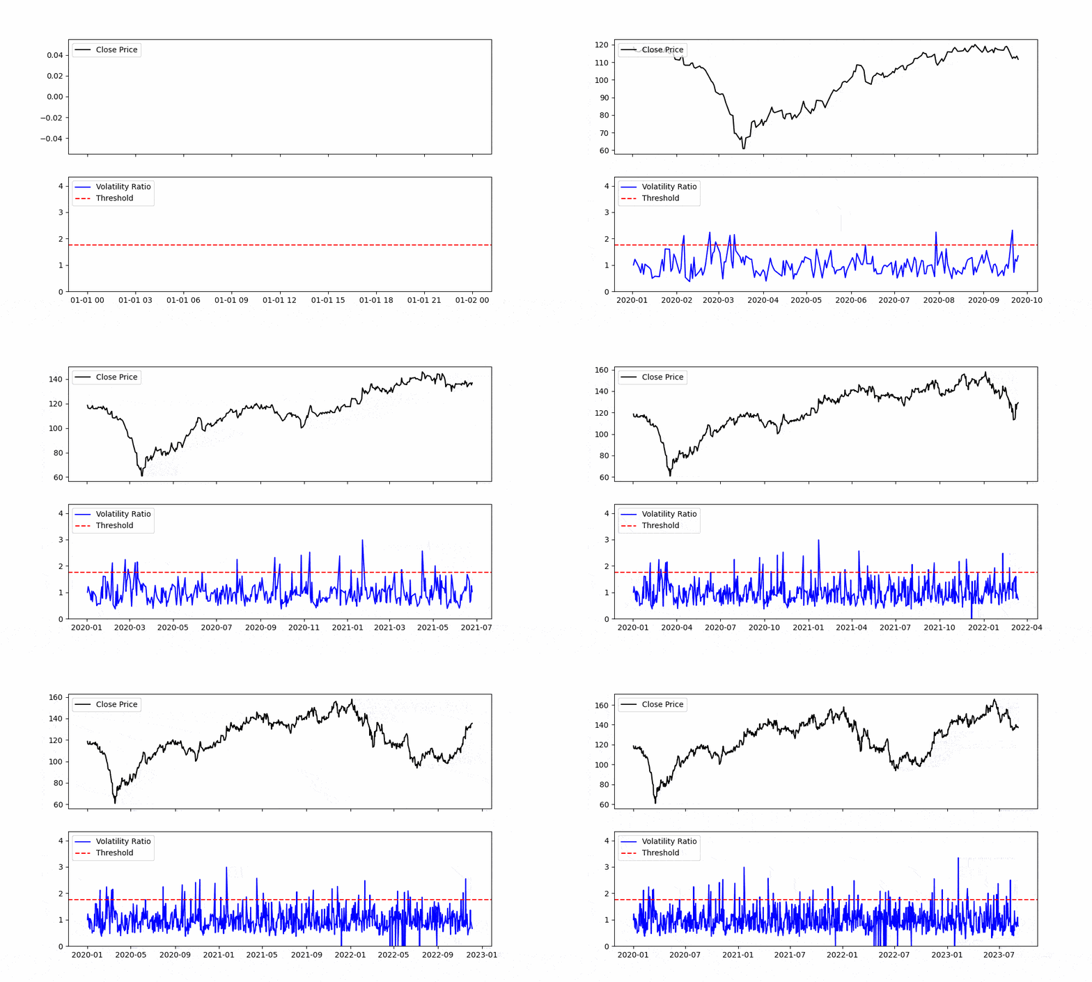
Figure. 1: This animation illustrates the evolving volatility ratio over a specified time span. As the timeline progresses, observe the fluctuations and zones where the ratio exceeds the defined threshold, giving investors a visual representation of periods of heightened volatility, potential trading interest, and pivotal market moments.
The next step involves computing the True Range, followed by our primary focus — the Volatility Ratio. Here’s how it’s accomplished in Python:
					# Calculate True Range
data['High_Low'] = data['High'] - data['Low']
data['High_PrevClose'] = abs(data['High'] - data['Close'].shift())
data['Low_PrevClose'] = abs(data['Low'] - data['Close'].shift())
data['True_Range'] = data[['High_Low', 'High_PrevClose', 'Low_PrevClose']].max(axis=1)

# Calculate the N-day EMA of True Range
n = 14
data['EMA_True_Range'] = data['True_Range'].ewm(span=n, adjust=False).mean()

# Compute Volatility Ratio
data['Volatility_Ratio'] = data['True_Range'] / data['EMA_True_Range']
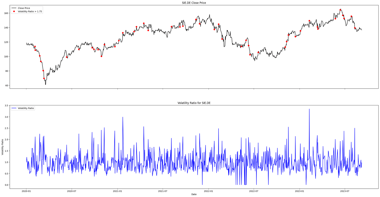
Visual representation can convey what raw numbers often can’t. Using Python’s Matplotlib library, we can visualize both the stock’s closing price and its corresponding Volatility Ratio. Putting all the code together we get:

Newsletter