Build the most-used trading indicator by institutional traders across time frames, with volume and volatility overlays.
Anchored VWAP is a key reference point for institutions to measure where fair value sits, at least from a trading perspective.
This indicator locks in the true average price, weighted by volume, starting from any event or the session open.
Large traders use anchored VWAP to see where money has actually changed hands since an event, a gap, or a trend reversal.
Anchor VWAP gives signs of regime change, supply and demand, and crowd positioning.
Most price tools only track momentum or moving averages. Anchored VWAP shows where the bulk of capital is committed.
That’s where real support and resistance emerge.
The complete Python notebook for the analysis is provided below.

1. Why Anchoring VWAP Matters
Anchored VWAP tracks the true average price paid, weighted by volume, since a specific starting point.
The formula is simple:
Pi​ is the typical price at bar i, and Vi​ is the volume. By changing the anchor date, you reset the calculation.
This method isn’t just theoretical. For example, A 2020 JPMorgan equity execution desk report called anchored VWAP:
Institutional trading teams use this to answer one question:
Where has real money flowed since the last major event?
After earnings, a Fed decision, or a market gap, they reset the anchor. Academic research backs this up.
Academic research backs this up. A 2018 SSRN paper found that
Anchored VWAP highlights the point where buyers and sellers reach equilibrium after the narrative changes. It filters out irrelevant history.

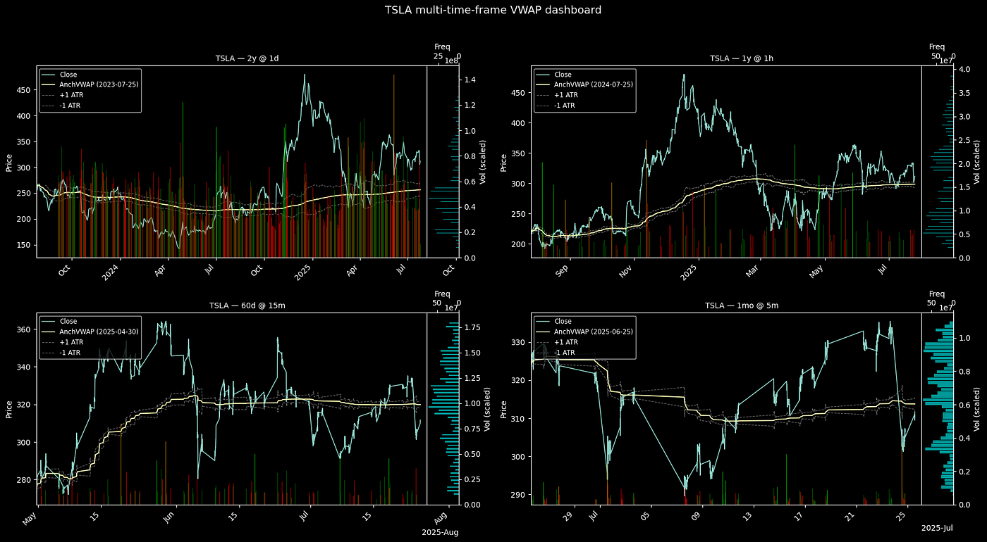
Figure 1. Anchored VWAP (dashed line) acting as a dynamic reference point. Price repeatedly tests this level, with each rejection or breakout signaling a shift in market control. Source: tradebrigade.co.
2. Anchored VWAP in Python
This script builds a four-panel dashboard, each anchored either to a specific date or the beginning of the dataset.
It overlays anchored VWAP, and adds dynamic ATR bands to each panel.
2.1 Adjusting Parameters
Each step is parameterized. You can control many elements of the dashboard.
Every key aspect that is adjustable:
- TICKER sets the asset under analysis.
- TIMEFRAMES defines the periods and intervals for each subplot.
- SCALE_FACTOR changes the volume bar height. Raise it for more prominent volume, lower for a cleaner chart.
- ATR_LEN determines how smooth or sensitive the ATR bands are. Increase for smoother bands, decrease for more responsiveness.
- RVOL_LEN sets the rolling window for average volume in the RVOL calculation.
- RVOL_THR flags unusually high volume. Lower values flag more bars; higher values highlight only extreme outliers.
- HIST_BINS changes the granularity of the right-side price histogram.
- EXTRA_RIGHT adds blank space after the last bar for clarity.
- PAD_RIGHT controls the space between the price plot and the histogram.
- ANCHOR_DATE lets you pick where to anchor VWAP. Use a date string to anchor at a major event. Set to None to use the start of the dataset.
import yfinance as yf
import pandas as pd
import numpy as np
import matplotlib.pyplot as plt
import matplotlib.dates as mdates
from mpl_toolkits.axes_grid1 import make_axes_locatable
# ── adjustable settings
TICKER = "TSLA"
TIMEFRAMES = [
("2y", "1d"),
("1y", "1h"),
("60d", "15m"),
("1mo", "5m")
]
SCALE_FACTOR = 0.5 # scales volume bar height; ↑ = taller bars, ↓ = shorter bars
ALPHA_VOL = 0.6 # volume bar opacity; ↑ = more opaque, ↓ = more transparent
ATR_LEN = 14 # ATR lookback length; ↑ = smoother ATR, ↓ = more sensitive ATR
RVOL_LEN = 30 # rolling window for avg volume; ↑ = slower baseline, ↓ = faster baseline
RVOL_THR = 2 # relative-volume flag threshold; ↑ = fewer bars flagged, ↓ = more flagged
HIST_BINS = 50 # number of bins in price histogram; ↑ = finer resolution, ↓ = coarser
EXTRA_RIGHT = 0.10 # % of total time span added as blank room on right; ↑ = more blank space, ↓ = less
PAD_RIGHT = 0.65 # fraction of axes width between price plot & histogram; ↑ = wider gap, ↓ = narrower
# Anchor VWAP here. Use None to anchor at dataset start.
ANCHOR_DATE = None # e.g. "2023-01-15"; set a date for custom VWAP start, None defaults to first timestamp
2.1 Helper Functions
The script uses three helpers:
- download_ohlc() fetches and cleans historical OHLCV data using yfinance.
- anchored_vwap() computes the anchored VWAP following the formula presented above.
- atr() calculates the Average True Range over a window for dynamic volatility bands.
# ---------- helpers
def download_ohlc(ticker: str, period: str, interval: str) -> pd.DataFrame:
df = yf.download(
ticker, period=period, interval=interval,
auto_adjust=True, progress=False
)
if isinstance(df.columns, pd.MultiIndex):
df.columns = df.columns.get_level_values(0)
df.columns = df.columns.map(str.title)
return df.dropna(subset=["Open", "High", "Low", "Close"])
def anchored_vwap(df: pd.DataFrame, anchor_ts: pd.Timestamp) -> pd.Series:
tp = (df["High"] + df["Low"] + df["Close"]) / 3
mask = df.index >= anchor_ts
cum_pv = (tp * df["Volume"]).where(mask).cumsum()
cum_v = df["Volume"].where(mask).cumsum()
return cum_pv / cum_v
def atr(high, low, close, length: int = 14) -> pd.Series:
tr = pd.concat([
high - low,
(high - close.shift()).abs(),
(low - close.shift()).abs()
], axis=1).max(axis=1)
return tr.rolling(length).mean()
2.3. Panel Plotting Function
Each subplot calls plot_panel(). This function:
- Sets the anchor date.
- Computes and overlays the anchored VWAP and ATR bands.
- Flags high-relative-volume bars in green, red, lime, or orange based on price direction and volume spike.
- Adds a price histogram on the right for quick context on price clustering.
- Labels everything for quick interpretation.
ATR bands are plotted as dashed lines above and below the anchored VWAP.
They define a volatility-adjusted range. Price movement outside these bands marks unusual volatility.
Newsletter