import numpy as np
import pandas as pd
import yfinance as yf
import matplotlib.pyplot as plt
from matplotlib.dates import AutoDateLocator, AutoDateFormatter
# ── USER PARAMS
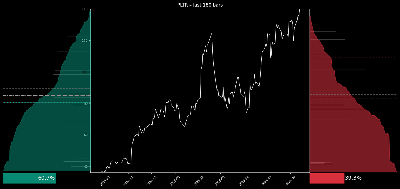
TICKER = "PLTR"
START = "2024-01-01"
END = "2025-07-13"
INTERVAL = "1d"
VISIBLE_BARS = 180 # decrease for fewer datapoints or increase for broader history
TICK_SIZE = 0.01 # smaller values give finer resolution, larger smooth the chart
# color definitions
BULL_EDGE_COLOR = "#089981"
BULL_FILL_COLOR = (8/255,153/255,129/255,0.90)
BEAR_EDGE_COLOR = "#F23645"
BEAR_FILL_COLOR = (242/255,54/255,69/255,0.90)
# ── FETCH DATA
df = yf.download(
TICKER,
start=START,
end=END,
interval=INTERVAL,
auto_adjust=True,
progress=False
)
if isinstance(df.columns, pd.MultiIndex):
df.columns = df.columns.get_level_values(0)
vis = df.tail(VISIBLE_BARS).copy()