Experience the Future of Intelligent Investing Today
Back To Top
Experience the Future of Intelligent Investing Today
Every trader dreads market crashes, those moments when the market unexpectedly plunges. One minute everything is smooth, and the next, portfolios turn red. Hours are spent analyzing charts for any warning signs.
Investors, analysts, and casual observers watch their screens in panic, fearing their financial stability may collapse. Despite their negative impact, market crashes are an inevitable part of trading.
However, what if there was a way to foresee or at least get a hint of the market’s next critical moves? Enter topology, a branch of mathematics that examines shapes and spaces.
Instead of only observing peaks and troughs, imagine analyzing the intrinsic shapes within the market’s fluctuations. Topology introduces a novel and potentially revolutionary way to perceive these patterns.
In this article, we’ll demonstrate how to use topological data analysis to identify potential market crashes and downturns in the S&P 500. We will also provide Python code to help you apply the discussed techniques.

Topological Data Analysis, or TDA for short, offers a way to study the ‘shape’ (or topology) of data. Imagine plotting a scatter of points in space and then, instead of focusing on the individual points, you try to understand the overall shape they form. Moreover, TDA allows us to see patterns, holes, and other structures in data that might be invisible using traditional methods.
At its core, TDA asks a simple yet profound question: What is the intrinsic shape or structure of my data? It doesn’t care about distances or specific locations as much as how data points are connected and how they cluster together.
Persistence Homology is one of the key tools inTDA. At a high level, it helps us understand the ‘holes’ in our data at various scales. Imagine you have a Swiss cheese slice. Persistence Homology would not only tell you there are holes in the cheese, but it would also tell you how big these holes are and how they change if we were to melt the cheese slightly.
Mathematically, Persistence Homology is captured by something called a barcode or a diagram. It’s a collection of intervals, where each interval represents a feature (like a hole) in the data. The start and end of an interval tell us when a feature appears and when it disappears as we change the scale.

Equation. 1: Persistance Homology Formulation.
Now, let’s talk about the Wasserstein Distance. Think of it as a measure to compare two Persistence Homologies. Imagine you have two piles of sand representing two sets of data. The Wasserstein Distance, in essence, measures the least amount of effort you’d need to move the sand grains around to transform one pile into the shape of the other. The less effort (or distance you need to move the sand), the more similar the two piles are. If you have to move the sand a lot, it means the piles are quite different.
given two sets of data points, the Wasserstein Distance calculates the “minimal moving cost” to match the points from one set to the other. Formally, given two persistence diagrams D1 and D2, the Wasserstein distance measures the minimal effort to match features from D1 to D2.

Equation. 2: Wasserstein Distance.
While these ideas may sound complex, they give us a unique lens to view and compare data. In the context of the stock market, it offers a method to determine how similar or different two time periods might be, based on their underlying patterns.


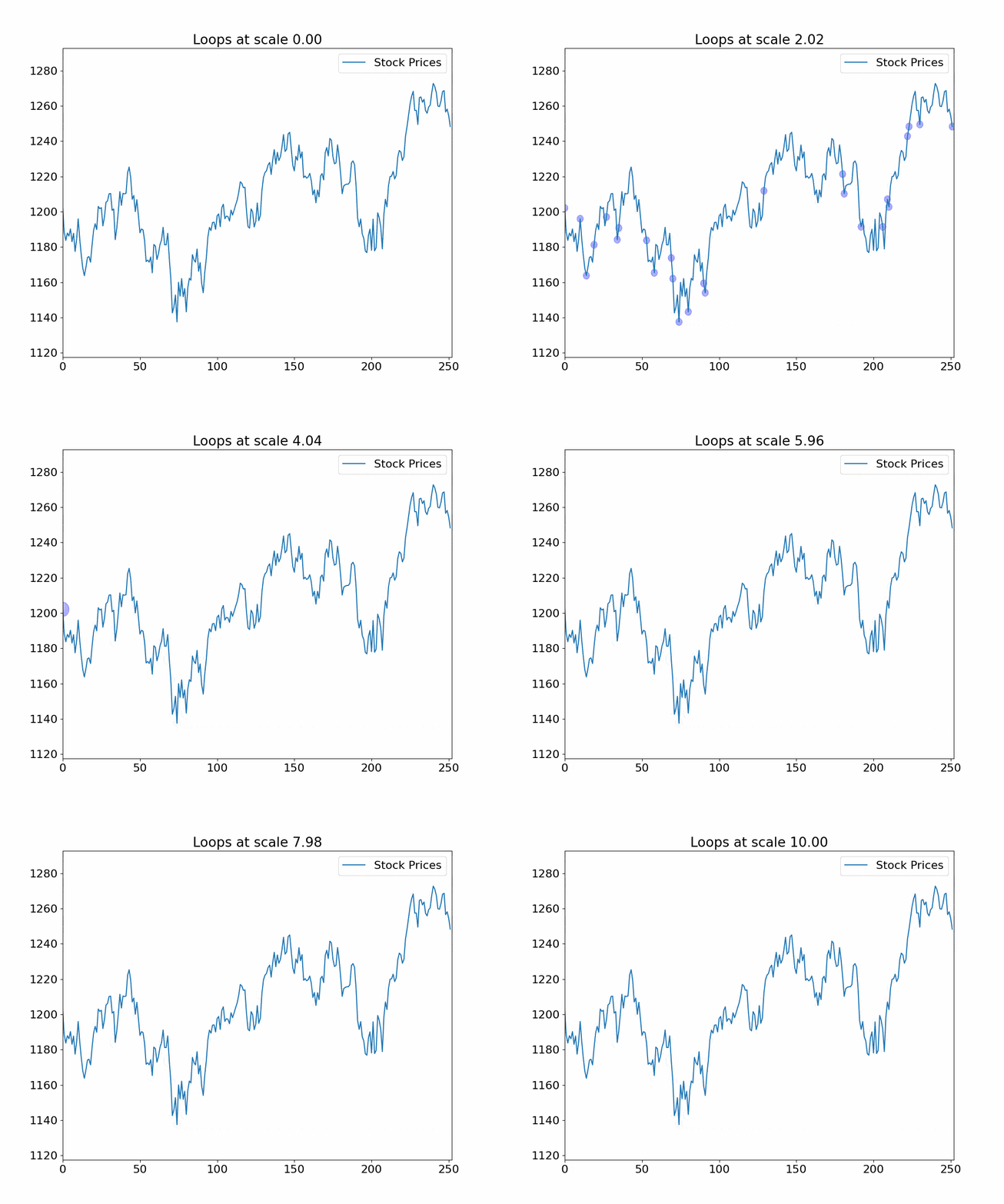
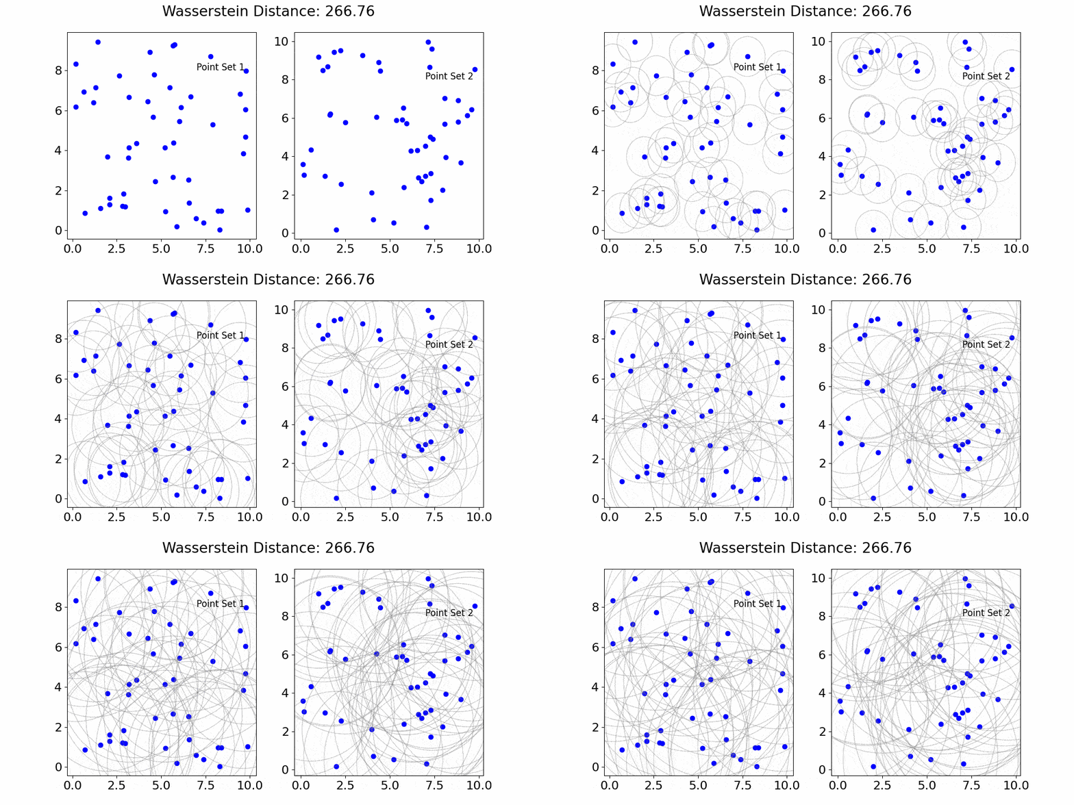
Figure 1. Deep Dive into the Market’s Topological Structure:On the left, you can see S&P 500 stock prices over time. Topological techniques here use expanding loops as ‘lenses’ to focus on data clusters. These loops highlight where prices move together, uncovering patterns, trends, or unusual market activity. On the right, the Wasserstein distance measures the ‘cost’ of transforming one set of points to another, such as segments of log returns. Changes around these points highlight their importance. A significant increase in this distance could indicate major market shifts. Together, these plots demonstrate how topological methods revolutionize our understanding of complex data, adapting to different scales and revealing insights that traditional analyses might overlook. This method is particularly effective in identifying potential market crashes.
Financial markets are complex and multi-dimensional, filled with intertwined relationships and feedback loops. Traditional analytical methods, often linear or based on fixed structures, may fail to capture these complex interactions. This is where Topological Data Analysis (TDA) steps in.
TDA helps us understand the ‘shape’ or topology of data, ensuring we fully recognize and understand the complexities and multi-scale structures in financial markets. This approach is particularly valuable in spotting potential market crashes.
Financial history is punctuated with numerous market crashes like that of 1929, Black Monday in 1987, and the more recent 2008 financial crisis. What’s common among these is their apparent unpredictability and the profound impact they’ve had on global economies.
Traditional indicators and models, built on the assumptions of normalcy, often fail to anticipate these ‘black swan’ events. Here lies the potential of TDA, which, by its very design, acknowledges and works with data’s inherent complexities.
We employe the Wasserstein distance — a metric from optimal transport theory — on financial time-series data. The essence is to compare and contrast two sets of points, segments of log returns in this case, to quantify the divergence in their structural patterns. This metric, while being inherently dynamic, offers insights into shifts in market dynamics, potentially hinting at unforeseen market movements.
Our Python implementation to leverage topological insights from stock market data is structured systematically. Let’s go through the steps.
This assemblage of libraries ensures our code’s backbone, with ripser and persim catering to the topological operations.
					import yfinance as yf
import numpy as np
from ripser import Rips
import persim
import matplotlib.pyplot as plt
import warnings
Log-returns provide relative price changes, transforming raw stock prices into a sequence representing the momentum or trend in the stock’s price.
log_returns = np.log(prices[1:] / prices[:-1])
To leverage the inherent topology in financial data, we perform the following steps:
By taking segments or windows of our log-return data, we aim to compare consecutive periods, understanding how the market’s structure evolves.
					segment1 = log_returns[i:i+window_size].reshape(-1, 1)
segment2 = log_returns[i+window_size:i+(2*window_size)].reshape(-1, 1)
Persistence diagrams are topological constructs capturing the birth and death of “features” in data. In the financial context, these “features” represent patterns or structures in price changes. The birth and death of such features may correspond to the emergence or dissolution of these patterns.
					dgm1 = rips.fit_transform(segment1)
dgm2 = rips.fit_transform(segment2)
How different are two consecutive windows in their topological structure? The Wasserstein distance gives an answer. As previously discussed, this metric measures the “effort” required to transform one persistence diagram into another. A spike in this value could signify substantial market changes.
distance = persim.wasserstein(dgm1[0], dgm2[0], matching=False)
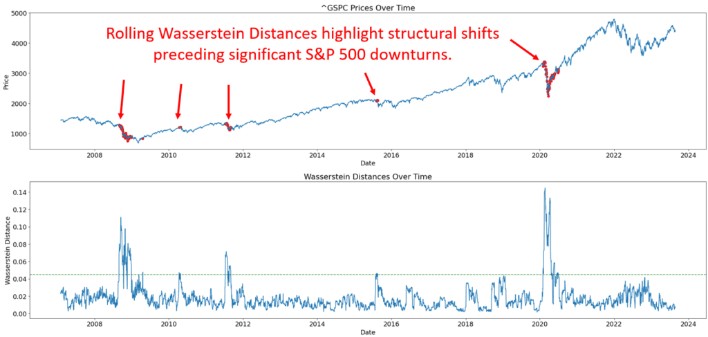
Here, the actual stock prices are plotted, but now with the power of topology. Red dots highlight areas where the Wasserstein distance between consecutive windows surpasses our set threshold. These can be seen as potential points of interest.
					ax[0].plot(valid_dates, prices.iloc[window_size:-window_size], label=ticker_name)
ax[0].scatter(alert_dates, alert_values, color='r', s=30)
This plot visualizes how the topological structure of the market evolves. Peaks in this graph could indicate potential structural shifts in market dynamics.
					ax[1].plot(valid_dates, valid_distances)
ax[1].axhline(threshold, color='g', linestyle='--', alpha=0.7)
Putting all of the above together, we get the following code

Newsletter