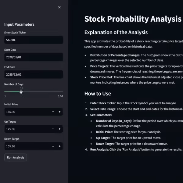
Visualize Key Movement Periods in Stock Prices
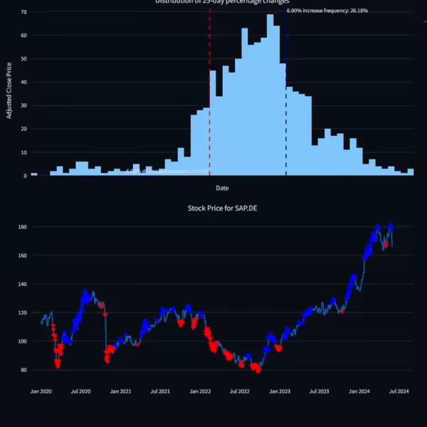
The app will display a histogram showing the distribution of percentage changes, with annotations for the frequencies of reaching the up and down targets.
A line chart will show the historical adjusted close prices, with markers indicating instances where the price targets were met.

