Effective Lesser-Known Trading Indicators Implemented - Choppiness, Disparity, Awesome, Three Way, RVI and More
Popular indicators often dominate discussions. Yet, lesser-known indicators provide unique market insights. This article explores these obscure but effective trading indicators.
Each tool offers a unique perspective on market trends, volatility, and momentum. Traders gain deeper insights into market movements.
We aim to provide comprehensive Python code for each indicator. This includes generating buy and sell signals. It enables these tools’ integration into market analysis and trading decisions.
Choppiness Index
Disparity Index Strategy
Awesome Indicator vs MACD
Three Way Average Cross Over
Trend Exhaustion
Aroon Oscilator
Demarker Indicator
Relative Vigor Index (RVI)
2. Python Implementation
2.1 Choppiness Index
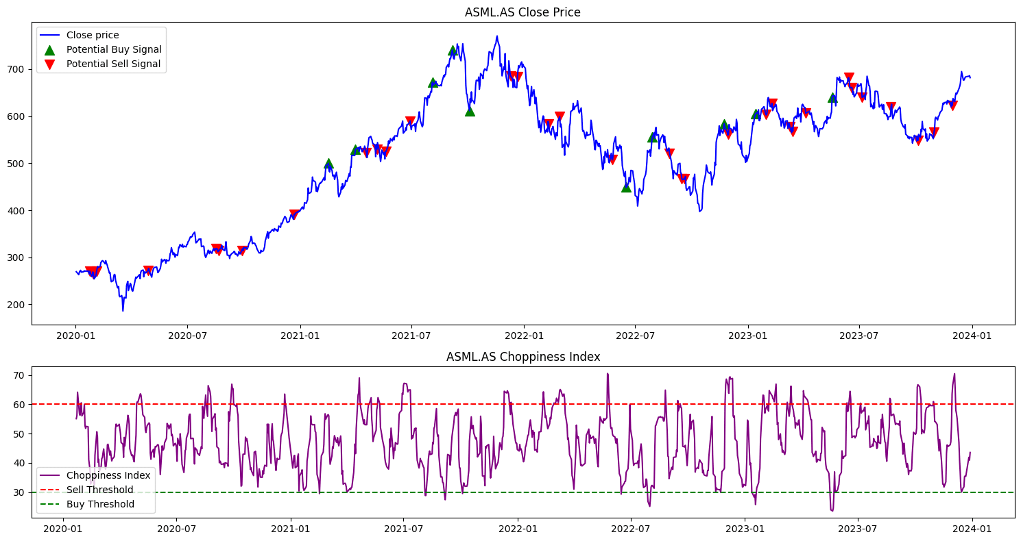
The Choppiness Index measures market volatility. A logarithmic formula calculates it by comparing the True Range’s sum over a set number of periods (N) with the market’s high and low range in the same period. The formula for the Choppiness Index (CI) follows:

Equation 1. The Choppiness Index (CI) formula evaluates market volatility by comparing the cumulative range of price movement to the overall price range within a specified period, offering insights into trend strength.
where:
- ∑i=1 True Rangei is the sum of the True Range over the last N periods.
- Highmax, N is the highest high over the last N periods.
- Lowmin, N is the lowest low over the last N periods.
- N is the number of periods used in the calculation (commonly set to 14).
Moreover, traders use the Choppiness Index to differentiate trending markets from range-bound ones. For instance, a low Choppiness Index value signals a strong trend. Conversely, high values suggest a more directionless market. This information helps traders decide whether to employ trend-following strategies or focus on range trading tactics.
					import yfinance as yf
import pandas as pd
import numpy as np
import matplotlib.pyplot as plt

def download_stock_data(ticker, start_date, end_date):
    """Download historical stock data."""
    return yf.download(ticker, start=start_date, end=end_date)

def calculate_true_range(data):
    """Calculate the True Range of the stock data."""
    return np.maximum.reduce([
        data['High'] - data['Low'],
        abs(data['High'] - data['Close'].shift()),
        abs(data['Low'] - data['Close'].shift())
    ])

def calculate_indicators(data, window_size):
    """Calculate ATR, highest high, lowest low, and Choppiness Index."""
    data['TR'] = calculate_true_range(data)
    data['ATR'] = data['TR'].rolling(window=window_size).mean()
    data['highestHigh'] = data['High'].rolling(window=window_size).max()
    data['lowestLow'] = data['Low'].rolling(window=window_size).min()

    # Calculate Choppiness Index
    data['Sum_TR'] = data['TR'].rolling(window=window_size).sum()
    data['Range'] = data['highestHigh'] - data['lowestLow']
    data['CHOP'] = 100 * np.log10(data['Sum_TR'] / data['Range']) / np.log10(window_size)
    data['CHOP'] = data['CHOP'].clip(lower=0, upper=100)

def generate_signals(data):
    """Generate buy and sell signals based on Choppiness Index."""
    data['CHOP_lag1'] = data['CHOP'].shift()
    data['signal'] = np.where((data['CHOP'] < 30) & (data['CHOP_lag1'] >= 30), 'look for buy signals',
                              np.where((data['CHOP'] > 60) & (data['CHOP_lag1'] <= 60), 'look for sell signals', 'neutral'))

def plot_data(data, ticker):
    """Plot stock prices and signals."""
    fig, ax = plt.subplots(2, 1, figsize=(15, 8), gridspec_kw={'height_ratios': [2, 1]})

    ax[0].plot(data['Close'], label='Close price', color='blue')
    buy_signals = data[data['signal'] == 'look for buy signals']
    sell_signals = data[data['signal'] == 'look for sell signals']
    ax[0].scatter(buy_signals.index, buy_signals['Close'], color='green', label='Potential Buy Signal', marker='^', alpha=1, s=100)
    ax[0].scatter(sell_signals.index, sell_signals['Close'], color='red', label='Potential Sell Signal', marker='v', alpha=1, s=100)
    ax[0].set_title(f"{ticker} Close Price")
    ax[0].legend()

    ax[1].plot(data['CHOP'], label='Choppiness Index', color='purple')
    ax[1].axhline(60, color='red', linestyle='--', label='Sell Threshold')
    ax[1].axhline(30, color='green', linestyle='--', label='Buy Threshold')
    ax[1].set_title(f"{ticker} Choppiness Index")
    ax[1].legend()

    plt.tight_layout()
    plt.show()

# Execute Functions
ticker = "ASML.AS"
data = download_stock_data(ticker, '2020-01-01', '2024-01-01')
window_size = 14  # You can adjust this value
calculate_indicators(data, window_size)
generate_signals(data)
plot_data(data, ticker)

Figure. 1: Illustration of Trend Identification Using the Choppiness Index - The chart demonstrates the application of the Choppiness Index, with the upper threshold indicating reduced market trendiness (potential sell signal) and the lower threshold suggesting emerging trends (potential buy signal).
2.2 Disparity Index Strategy
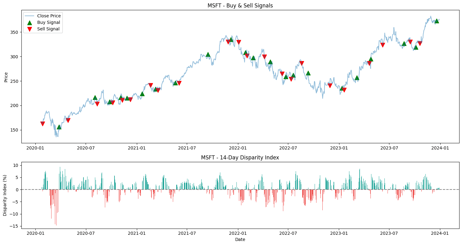
The Disparity Index is a technical indicator that measures the percentage difference between the latest closing price and a chosen moving average, reflecting short-term price fluctuations relative to a longer trend. The following formula calculates it:

Equation 2. The Disparity Index measures the relative position of the current closing price to a selected moving average, serving as a tool to identify potential price reversals by highlighting overbought or oversold conditions.
where:
- Closing Price is the most recent closing price of the asset.
- Moving Average is the moving average of the closing price over a specified period.
The Disparity Index, highlighting overbought or oversold conditions, helps identify potential price reversals. It measures the relative position of the current closing price to a selected moving average.
For example, a threshold of +/- 5% can signal when to consider entering or exiting a trade. Positive values indicate that the price is above the moving average (potential overvaluation), and negative values indicate the price is below the moving average (potential undervaluation).
					import numpy as np
import pandas as pd
import matplotlib.pyplot as plt
import yfinance as yf

# Function to download historical data
def get_historical_data(symbol, start_date, end_date):
    df = yf.download(symbol, start=start_date, end=end_date)
    return df

# Function to calculate disparity index
def get_di(data, lookback):
    ma = data.rolling(lookback).mean()
    return ((data - ma) / ma) * 100

# Implement the DI strategy
def implement_di_strategy(prices, di):
    buy_price = []
    sell_price = []
    di_signal = []
    signal = 0

    for i in range(len(prices)):
        if di[i-4] < 0 and di[i-3] < 0 and di[i-2] < 0 and di[i-1] < 0 and di[i] > 0:
            if signal != 1:
                buy_price.append(prices[i])
                sell_price.append(np.nan)
                signal = 1
                di_signal.append(signal)
            else:
                buy_price.append(np.nan)
                sell_price.append(np.nan)
                di_signal.append(0)
        elif di[i-4] > 0 and di[i-3] > 0 and di[i-2] > 0 and di[i-1] > 0 and di[i] < 0:
            if signal != -1:
                buy_price.append(np.nan)
                sell_price.append(prices[i])
                signal = -1
                di_signal.append(signal)
            else:
                buy_price.append(np.nan)
                sell_price.append(np.nan)
                di_signal.append(0)
        else:
            buy_price.append(np.nan)
            sell_price.append(np.nan)
            di_signal.append(0)

    return buy_price, sell_price, di_signal

# Main function to execute the strategy
def execute_di_strategy(stock_symbol, start_date, end_date):
    stock_data = get_historical_data(stock_symbol, start_date, end_date)
    stock_data['di_14'] = get_di(stock_data['Close'], 14)
    stock_data.dropna(inplace=True)

    buy_price, sell_price, _ = implement_di_strategy(stock_data['Close'], stock_data['di_14'])

    # Plotting the buy and sell signals along with DI
    fig, ax = plt.subplots(2, 1, figsize=(15, 8), gridspec_kw={'height_ratios': [2, 1]})

    # Plotting the stock price and signals
    ax[0].plot(stock_data['Close'], label='Close Price', alpha=0.5)
    ax[0].scatter(stock_data.index, buy_price, label='Buy Signal', marker='^', color='green', s=100)
    ax[0].scatter(stock_data.index, sell_price, label='Sell Signal', marker='v', color='red', s=100)
    ax[0].set_title(f'{stock_symbol} - Buy & Sell Signals')
    ax[0].set_ylabel('Price')
    ax[0].legend()

    # Plotting the Disparity Index with bars
    ax[1].bar(stock_data.index, stock_data['di_14'], color=np.where(stock_data['di_14'] >= 0, '#26a69a', '#ef5350'))
    ax[1].axhline(0, color='gray', linestyle='--')  # Add a line at zero
    ax[1].set_title(f'{stock_symbol} - 14-Day Disparity Index')
    ax[1].set_xlabel('Date')
    ax[1].set_ylabel('Disparity Index (%)')

    plt.tight_layout()
    plt.show()

# Example usage
stock_symbol = "MSFT"
start_date = "2020-01-01"
end_date = "2024-01-01"
execute_di_strategy(stock_symbol, start_date, end_date)

Figure. 2: Trading Signal Analysis with Disparity Index - The upper chart tracks the closing prices, with buy (green) and sell (red) signals. The lower chart displays the 14-Day Disparity Index, where values above and below the zero line can indicate overbought or oversold conditions, respectively.
2.3 Awesome Indicator vs MACD
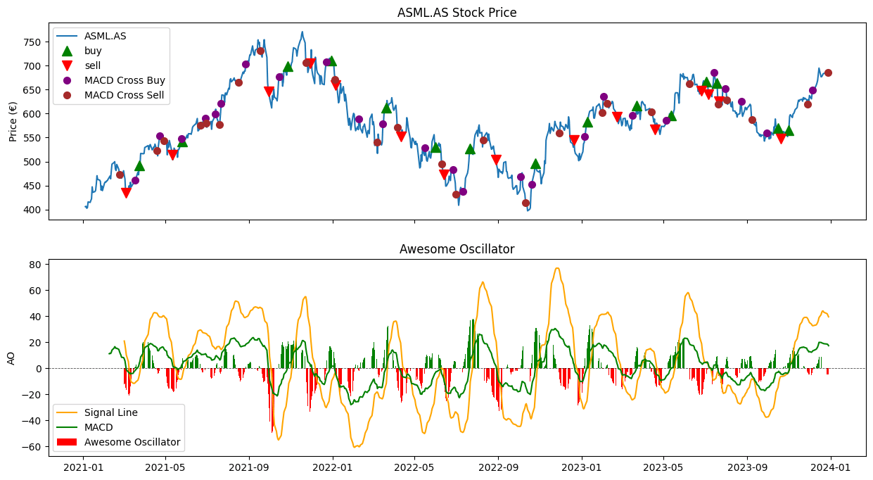
The Awesome Oscillator (AO) and Moving Average Convergence Divergence (MACD) are both momentum indicators. However, they calculate momentum differently.
1. Awesome Oscillator (AO): The AO is calculated by subtracting a 34-period simple moving average (SMA) of the midpoint of the bars (average of the high and low) from a 5-period SMA of the midpoint. The formula is:
Equation 3. The Awesome Oscillator (AO) calculates market momentum based on moving averages, distinguishing between market forces of bulls and bears to pinpoint trade opportunities.
2. Moving Average Convergence Divergence (MACD): The MACD is calculated as the difference between a 12-period exponential moving average (EMA) and a 26-period EMA of the closing prices. The MACD Signal line is then derived as a 9-period EMA of the MACD.

Equation 4. The Moving Average Convergence Divergence (MACD) is calculated as the difference between two exponential moving averages (EMAs), providing a gauge for market momentum and potential trend changes.
While the MACD effectively confirms trends, the Awesome Oscillator can respond more quickly to immediate price changes. Combining these, a trader might use the MACD for trend direction and the Awesome Oscillator for precise entry and exit points.
In contrast, the Awesome Oscillator excels in capturing short-term market momentum. In contrast, traders often use the MACD to identify longer-term trend direction and momentum changes.
					import yfinance as yf
import ta
import matplotlib.pyplot as plt
import numpy as np

def download_stock_data(ticker, start_date, end_date):
    """Download historical stock data."""
    return yf.download(ticker, start=start_date, end=end_date)

def calculate_indicators(data):
    """Calculate trading indicators."""
    # Awesome Oscillator
    data['ao'] = ta.momentum.AwesomeOscillatorIndicator(data['High'], data['Low']).awesome_oscillator()
    data['signal_line'] = ta.trend.ema_indicator(data['ao'], window=9)

    # MACD
    macd_indicator = ta.trend.MACD(data['Close'])
    data['macd'] = macd_indicator.macd()
    data['macd_signal'] = macd_indicator.macd_signal()

    return data

def generate_ao_signals(data):
    """Generate trading signals for Awesome Oscillator."""
    data['zero_cross'] = np.where((data['ao'].shift(1) < 0) & (data['ao'] > 0), True,
                                  np.where((data['ao'].shift(1) > 0) & (data['ao'] < 0), False, np.NaN))
    return data

def generate_macd_signals(data):
    """Generate trading signals for MACD."""
    data['macd_cross'] = np.where((data['macd'].shift(1) < data['macd_signal'].shift(1)) & (data['macd'] > data['macd_signal']), True,
                                  np.where((data['macd'].shift(1) > data['macd_signal'].shift(1)) & (data['macd'] < data['macd_signal']), False, np.NaN))
    return data

def plot_data(data, ticker):
    """Plot stock prices and indicators."""
    fig, (ax1, ax2) = plt.subplots(2, sharex=True, figsize=(15, 8))

    # Plot stock price with signals
    ax1.plot(data.index, data['Close'], label='ASML.AS')
    buy_signals = data[data['zero_cross'] == True]
    sell_signals = data[data['zero_cross'] == False]
    ax1.plot(buy_signals.index, data.loc[buy_signals.index]['Close'], '^', markersize=10, color='g', label='buy')
    ax1.plot(sell_signals.index, data.loc[sell_signals.index]['Close'], 'v', markersize=10, color='r', label='sell')

    macd_cross_buy = data[data['macd_cross'] == True]
    macd_cross_sell = data[data['macd_cross'] == False]
    ax1.plot(macd_cross_buy.index, data.loc[macd_cross_buy.index]['Close'], 'o', markersize=7, color='purple', label='MACD Cross Buy')
    ax1.plot(macd_cross_sell.index, data.loc[macd_cross_sell.index]['Close'], 'o', markersize=7, color='brown', label='MACD Cross Sell')
    ax1.set_title(f'{ticker} Stock Price')
    ax1.set_ylabel('Price (€)')
    ax1.legend(loc='upper left')

    # Plot Awesome Oscillator histogram
    ax2.bar(data.index, data['ao'] - data['signal_line'], color=['g' if data['ao'].iloc[i] > data['signal_line'].iloc[i] else 'r' for i in range(len(data))], label='Awesome Oscillator')
    ax2.axhline(0, color='black', linewidth=0.6, linestyle='--', alpha=0.7)
    ax2.set_title('Awesome Oscillator')
    ax2.set_ylabel('AO')
    ax2.plot(data.index, data['signal_line'], label='Signal Line', color='orange')
    ax2.plot(data.index, data['macd'], label='MACD', color='green')
    ax2.legend(loc='best')

    plt.show()

ticker = "ASML.AS"
data = download_stock_data(ticker, '2021-01-01', '2024-01-01')
data = calculate_indicators(data)
data = generate_ao_signals(data)
data = generate_macd_signals(data)
plot_data(data, ticker)

Figure. 3: The Awesome Oscillator (AO) below, with its histogram and signal line, measures market momentum and helps identify potential trend reversals, while the MACD line crossover points, marked on the price chart, offer additional buy (purple) and sell (brown) signals based on the momentum and trend shifts.
2.4 Three Way Average Cross Over
This strategy involves using short, medium, and long-term moving averages. A bullish signal is generated when the short crosses above the medium and long averages, while a bearish signal occurs when it crosses below.
For a balanced approach, traders might use a combination of 15-day, 50-day, and 100-day moving averages, adjusting these based on the asset’s volatility and the trader’s timeframe.
For more on moving averages, we reccomend reading this this article:
Top 36 Moving Average Methods For Stock Prices in Python
					import matplotlib.lines as mlines
import yfinance as yf
import matplotlib.pyplot as plt
from mpl_finance import candlestick_ohlc
import matplotlib.dates as mdates
import matplotlib.colors as mcolors
import numpy as np
import matplotlib.ticker as ticker
import pandas as pd

# Set the start and end dates
start_date = '2020-01-01'
end_date = '2024-03-26'
symbol = 'UNA.AS'

def moving_average_strategy(df, ma1, ma2, ma3):
    # Calculate the moving averages
    ma_short = df['Close'].rolling(window=ma1).mean()
    ma_mid = df['Close'].rolling(window=ma2).mean()
    ma_long = df['Close'].rolling(window=ma3).mean()

    # Find where the moving averages cross
    cross_buy = ((ma_short > ma_long) & (ma_mid > ma_long)) & ((ma_short.shift() < ma_long.shift()) | (ma_mid.shift() < ma_long.shift()))
    cross_sell = (ma_short < ma_mid) | (ma_short < ma_long)

    first_buy_signal = False
    signals = pd.DataFrame(columns=['Type', 'Date', 'Price'])

    for date, row in df.iterrows():
        if cross_buy.loc[date] and not first_buy_signal:
            first_buy_signal = True
            new_signal = pd.DataFrame({'Type': ['Buy'], 'Date': [date], 'Price': [row['Low']]})
            signals = pd.concat([signals, new_signal], ignore_index=True)
        elif cross_sell.loc[date] and first_buy_signal:
            first_buy_signal = False
            new_signal = pd.DataFrame({'Type': ['Sell'], 'Date': [date], 'Price': [row['High']]})
            signals = pd.concat([signals, new_signal], ignore_index=True)

    signals.reset_index(drop=True, inplace=True)

        # Calculate the returns for each trade
    signals['Returns'] = np.nan

    for i in range(0, len(signals) - 1, 2):
        buy_price = signals.iloc[i]['Price']
        sell_price = signals.iloc[i + 1]['Price']
        signals.iloc[i + 1, signals.columns.get_loc('Returns')] = sell_price - buy_price

    # Calculate the metrics
    total_net_profit = signals['Returns'].sum()
    losing_trade_sum = abs(signals[signals['Returns'] < 0]['Returns'].sum())
    profit_factor = signals[signals['Returns'] > 0]['Returns'].sum() / losing_trade_sum if losing_trade_sum != 0 else np.inf
    percent_profitable = len(signals[signals['Returns'] > 0]) / (len(signals) / 2) * 100
    average_trade_net_profit = signals['Returns'].mean()
    drawdown = (signals['Price'].cummax() - signals['Price']).max()

    return total_net_profit, average_trade_net_profit

# Get the data from Yahoo Finance using yfinance library
stock_ohlc = yf.Ticker(symbol)
df = stock_ohlc.history(start=start_date, end=end_date)

# Define the range of values for the moving average parameters
ma1_range = range(3, 21)
ma2_range = range(3, 21)
ma3_range = range(3, 21)

# Initialize the best parameters and their associated metrics
best_params = (0, 0, 0)
best_total_net_profit = -np.inf
best_net_profit_per_trade = -np.inf

# Perform a grid search to find the best parameters
for ma1 in ma1_range:
    for ma2 in ma2_range:
        for ma3 in ma3_range:
            if ma1 != ma2 and ma1 != ma3 and ma2 != ma3:
                total_net_profit, net_profit_per_trade = moving_average_strategy(df, ma1, ma2, ma3)

                if total_net_profit > best_total_net_profit and net_profit_per_trade > best_net_profit_per_trade:
                    best_params = (ma1, ma2, ma3)
                    best_total_net_profit = total_net_profit
                    best_net_profit_per_trade = net_profit_per_trade

print("Best Parameters: MA1 =", best_params[0], "MA2 =", best_params[1], "MA3 =", best_params[2])
print("Best Total Net Profit:", best_total_net_profit)
print("Best Net Profit Per Trade:", best_net_profit_per_trade)

def major_date_formatter(x, pos=None):
    dt = mdates.num2date(x)
    if dt.day == 1:
        return f'{dt.strftime("%b")} {dt.year}'
    return ''

def minor_date_formatter(x, pos=None):
    dt = mdates.num2date(x)
    if dt.day == 1:
        return f'{dt.day}\n\n{dt.strftime("%b")} {dt.year}' if dt.month == 1 else f'{dt.day}\n\n{dt.strftime("%b")}'
    return f'{dt.day}'

# Get the data from Yahoo Finance using yfinance library
stock_ohlc = yf.Ticker(symbol)
df = stock_ohlc.history(start=start_date, end=end_date)

ma_1_window = 3
ma_2_window = 6
ma_3_window = 5

# Calculate the moving averages
ma_1 = df['Close'].rolling(window=ma_1_window).mean()
ma_2 = df['Close'].rolling(window=ma_2_window).mean()
ma_3 = df['Close'].rolling(window=ma_3_window).mean()

# Find where the moving averages cross
cross_buy = ((ma_1 > ma_3) & (ma_2 > ma_3)) & ((ma_1.shift() < ma_3.shift()) | (ma_2.shift() < ma_3.shift()))
cross_sell = (ma_1 < ma_2) | (ma_1 < ma_3)

# Convert the date to the matplotlib date format
df['Date'] = mdates.date2num(df.index)

# Create the plot
fig, ax = plt.subplots(figsize=(15, 8))

# Plot the moving averages
ax.plot(df.index, ma_1, color='tab:blue', label='{0}-day MA'.format(ma_1_window), linestyle='--')
ax.plot(df.index, ma_2, color='tab:orange', label='{0}-day MA'.format(ma_2_window), linestyle='--')
ax.plot(df.index, ma_3, color='tab:green', label='{0}-day MA'.format(ma_3_window), linestyle='--')

# Plot the candlesticks
candlestick_ohlc(ax, df[['Date', 'Open', 'High', 'Low', 'Close']].values, width=0.6, colorup='green', colordown='red')

# Create markers for buy and sell signals
buy_marker = mlines.Line2D([], [], color='blue', marker='^', linestyle='None', markersize=10, label='Buy')
sell_marker = mlines.Line2D([], [], color='red', marker='v', linestyle='None', markersize=10, label='Sell')

# Initialize buy and sell signal flags
first_buy_signal = False
buy_dates, buy_prices, sell_dates, sell_prices = [], [], [], []

# Record prices and dates for buy and sell signals
for date, row in df.iterrows():
    if cross_buy.loc[date] and not first_buy_signal:
        first_buy_signal = True
        buy_dates.append(date)
        buy_prices.append(row['Low'])
    elif cross_sell.loc[date] and first_buy_signal:
        first_buy_signal = False
        sell_dates.append(date)
        sell_prices.append(row['High'])

# Plot the buy and sell markers
ax.plot(buy_dates, buy_prices, '^', markersize=7, color='blue', label='Buy')
ax.plot(sell_dates, sell_prices, 'v', markersize=7, color='red', label='Sell')

# Add the legend and title
ax.legend(handles=[buy_marker, sell_marker])
ax.set_title(symbol + ' Stock Price Chart with Buy and Sell markers')

# Set y-axis label
ax.set_ylabel('Price')

plt.show()
Best Parameters: MA1 = 3 MA2 = 5 MA3 = 4 Best Total Net Profit: 68.97 Best Net Profit Per Trade: 0.69

Figure. 4: Triple Moving Average Crossover Signals - The chart illustrates price movements intersecting with three moving averages, signaling potential buys (blue) and sells (red) at the crossovers.
2.5 Trend Exhaustion
Trend exhaustion indicates that a current trend is weakening and may reverse. It’s often identified through divergences in momentum indicators or volume analysis.
When signs of exhaustion appear, like divergences in the RSI or declining volume on uptrends, traders should consider tightening stop-losses or taking profits, preparing for a potential trend reversal.

Newsletter